| Image |
Comment |
| 06/25/2003 08:15:05 AM |
Me-Myselfby justineComment by kiwiness: Ah Justine! Now I know what you really look like. Actually just as I imagined you :-) Hi there. |
 Photographer found comment helpful. Photographer found comment helpful. |
| 06/25/2003 12:40:36 AM |
Me-Myselfby justineComment by stephan: Now I see who is behind all the nice comments, justine! :)
The lighting is ok, but I would have cropped out the white areas on the left side and on the top. The massive blur is nice. |
| Photographer found comment helpful. |
| 06/24/2003 04:32:06 AM |
Me-Myselfby justineComment by myqyl: Very expressive and wonderfully lit! The dark background at the bottom worried me a little and I think it might have been better with a more uniform background, but this is still a shot to be proud of :) Congrats! |
| Photographer found comment helpful. |
| 06/23/2003 11:05:59 PM |
Me-Myselfby justineComment by jdavis: I like the softness & composition. Good job. I would like to see a different background though. |
| Photographer found comment helpful. |
| 06/23/2003 06:25:09 PM |
|
| Photographer found comment helpful. |
| 06/23/2003 01:07:37 PM |
|
| 06/23/2003 04:50:21 AM |
Me-Myselfby justineComment by inspzil: This port has a nice softness to it. It also is blinding at the top of the frame. Pretty nice pic despite that super hot spot. |
| Photographer found comment helpful. |
| 06/22/2003 08:35:05 AM |
Me-Myselfby justineComment by Olyuzi: I like your pose, expression and pleasing features. Your face is well lit with a nice soft natural light despite the strong backlighting, but there appears to be a slight yellow color cast to the picture that is not flattering. Also, I don't like the sudden demarcation between the white and yellow background and find that the upper white part of the background is empty space that adds nothing to the photo. Focus is too soft as well. |
| Photographer found comment helpful. |
| 06/21/2003 06:08:12 AM |
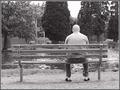
'A world off center'by justineComment by jjbeguin: Good idea, if you had moved slightly to the right, the man's head could have been displayed in a more dramatic way against the dark foliage. |
| 06/21/2003 02:32:14 AM |
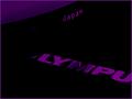
Unilluminatedby justineComment by mzanoni: Nice, dark colors while retaining some light. The light in the corner really draws my eye to it and is distracting to the main components "japan" and "lympu". |
| Photographer found comment helpful. |
Home -
Challenges -
Community -
League -
Photos -
Cameras -
Lenses -
Learn -
Help -
Terms of Use -
Privacy -
Top ^
DPChallenge, and website content and design, Copyright © 2001-2026 Challenging Technologies, LLC.
All digital photo copyrights belong to the photographers and may not be used without permission.
Current Server Time: 07/28/2026 06:59:05 AM EDT.