| Image |
Comment |
| 02/06/2005 03:08:24 AM |
|
| 02/05/2005 04:40:52 AM |
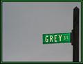
the greyest of all blue skiesby kelweisComment by mycelium: nice minimalism. i like the triple border, but i think the blacks are too thick i'd have gone with one pixel inside and out and expanded the green to fill in the space. |
| 02/04/2005 02:23:26 PM |
the greyest of all blue skiesby kelweisComment by Node: What a shame. The border just kills this for me and I don't hate borders at all. Great and different idea maybe if you mover the post into the fram a little it would have more impact. |
| 02/04/2005 10:00:56 AM |
|
| 02/03/2005 03:24:00 AM |
|
| 02/02/2005 06:22:33 PM |
the greyest of all blue skiesby kelweisComment by sibeling: Great shot, but the border makes it look like clip art, in my opinion. There's a lot of "artifacts" around the post & sign, which is from overcompression - the file size is only about 18K, but it can be up to 150K. Great effort though, i still like it a lot. |
| 02/02/2005 10:53:48 AM |
|
| 02/02/2005 09:40:42 AM |
|
| 02/02/2005 08:10:54 AM |
|
| 02/02/2005 08:08:23 AM |
|
Home -
Challenges -
Community -
League -
Photos -
Cameras -
Lenses -
Learn -
Help -
Terms of Use -
Privacy -
Top ^
DPChallenge, and website content and design, Copyright © 2001-2026 Challenging Technologies, LLC.
All digital photo copyrights belong to the photographers and may not be used without permission.
Current Server Time: 07/15/2026 04:15:37 PM EDT.