| Image |
Comment |
| 07/31/2009 12:06:03 AM |
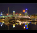
Midnight Blueby vladoComment by photobytes: You captured his user name, great, and his stile the blue pops out just like some of his pictures. |
 Photographer found comment helpful. Photographer found comment helpful. |
| 07/29/2009 11:27:40 PM |
|
| Photographer found comment helpful. |
| 07/27/2009 11:08:28 AM |
|
| Photographer found comment helpful. |
| 07/27/2009 10:12:38 AM |
|
| Photographer found comment helpful. |
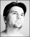
| 07/27/2009 06:44:50 AM |
Unshavenby vladoComment by Melethia: Perhaps a bit soft and a bit bright, but I recall when voting that I liked the ethereal feel of it, which is different given it is a treatment used more often with females than males. For a self portrait I think it's a good take (I'm assuming it's a self-portrait!) because for me it's wickedly hard to get one's self in focus. I know others manage to pull it off, but I have no idea how. I also checked out your outtakes - I think I prefer the direct eye contact in the B&W outtake, though that one too needed a bit more focus to really work well. |
| Photographer found comment helpful. |
| 07/27/2009 04:12:46 AM |
|
| Photographer found comment helpful. |
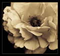
| 07/26/2009 12:12:31 PM |
Just Another Flowerby vladoComment by Jedusi: I really like this shot. The crop, the processing and the composition.
Certainly it could have had a greater DoF to include the centre of the flower . . it could also have had more bighting sharpness . . but as  Melethia Melethia says - there is a lovely gentleness about this picture which is aided by the toning.
My only nitpick is your title. For me titles are always important, (not that I'm great at them before you look) but they give the viewer an idea of what you are trying to capture and convey . . the message you want them to take away, or a context / framework to position the image in, even just a factual description of the object.
While this title may well have been intended as gently self depreciating, there is always a danger that it suggest you don't really care - and you know what ? If the artist doesn't really care - then why should the viewer ? You have a good range of titles on your other shot's and I think a shot as nice as this deserved more than 'Just another flower' ;- )
|
| Photographer found comment helpful. |
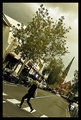
| 07/24/2009 07:58:03 PM |
Crossing Pratt Streetby vladoComment by Ecce_Signum: Greetings from Andi via the Critique Club for the second time this week lol.
First Impression: I love the jaunty angle, it frames the subject nicely but the sky is a bit blah. My first vote was a 6 and was bumped to a 7 on the second pass.
Composition: Excellent. The tilted aspect isn't to everybodies taste especially when there is no reason for it but it works well for me here and lines everything up nicely in the frame
Tecnical: Not 1005 sure about the colour/focus on the tree and the main subject is really just a black blob however, this is the street photography challenge so I'm not looking for studio lighting and whilst I'd like the colour to pop a little more I think its a great candid.
Artistic: Some people think using a jaunty angly on their shot makes it artistic but thats not true, there has to be a good reason for tilting the camera. For me the tilt here seems natural and everything fits nicely into the frame so yes, I think this is very artistic.
Overall thoughts: The zebra crossing, main tree, church and line down the road all work together and if it were shot at a different angle I think much of the impact would be lost. Choosing your moment to capture this image as the main subject crossed the zebra crossing is just inspired and I must say I prefer this to my last critique of your work - and that was a ribbon winner! |
| Photographer found comment helpful. |
| 07/24/2009 10:59:03 AM |
Unshavenby vladoComment by shalrath: I wish something was in focus completely here. Your title is unshaven, but even his beard is out of focus. The contrast is a little too much for what you were trying to convey, and the background blends into him. |
| Photographer found comment helpful. |
| 07/23/2009 04:49:00 PM |
Just Another Flowerby vladoComment by Melethia: LOL! I just drew you from the Critique Club... I've already commented on this twice, though, and you know I like it...
OK. Got an 8 from me. I loved the slight raggedness of the bloom, and as I mentioned before, the gentleness this conveys to me. I, being me, of course love the monochromatic nature (flowers can be quite lovely in monochrome, says me.)
So why the 5.5? Your commenters provide a bit of a clue - some people hate borders, some what deeper depth of field, and some, though I simply cannot understand them, don't like flowers in monochrome. Oh, and you've gone and allowed grain in the photo. What were you thinking? :-)
Anyway, hope this provides a bit of insight. If you have any questions, please don't hesitate to PM me. |
| Photographer found comment helpful. |
Home -
Challenges -
Community -
League -
Photos -
Cameras -
Lenses -
Learn -
Help -
Terms of Use -
Privacy -
Top ^
DPChallenge, and website content and design, Copyright © 2001-2026 Challenging Technologies, LLC.
All digital photo copyrights belong to the photographers and may not be used without permission.
Current Server Time: 06/18/2026 08:02:17 PM EDT.