DPChallenge: A Digital Photography Contest You are not logged in. (log in or register
 
Browse Settings
Currently viewing:
Registered Userjustinbrook

Show comments:

Per page:

Order:

Comments:


Comments Received by justinbrook
Pages:   ... ...
Showing 71 - 80 of ~270
Image Comment
STIMULATED
06/13/2005 05:24:42 AM
STIMULATED
by justinbrook

Comment by kiwinick:
like this although it lacks in the sharpness it makes up in the artistic stakes 10
Photographer found comment helpful.
The Harbour
05/22/2005 10:11:15 AM
The Harbour
by justinbrook

Comment by amber:
Hello from the Critique Club!

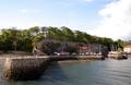
The idea behind this image is obviously about looking at the harbour from the outside; a traveller is coming home or paying a visit. As a traveller myself I can identify with the emotion behind the image.

However, in trying to get so much into the image the whole picture suffers from a lack of focus , detail and depth.

The eye is lead into the image by the harbour wall, which I love and which is good composition ( I really love the sinuous line of the wall as it flows into the harbour, I can see why you chose it) , but the eye can go no further as everything else is too far away or too out of focus. The viewer literally hit’s a brick wall. A greater depth of field, using a much smaller aperture may have helped, as would waiting till you were closer - but then you would have lost that lovely wall!

Your exposure, unfortunately, has resulted in a flat, washed out image which could have perhaps been improved in post production.

The right side of the image is over exposed due to the combination of the sun and your wide open aperture.

Much as I love that protruding wall perhaps you could have focused on the right hand side of the harbour, especially the boats and that opening in the wall, but perhaps you didn’t have that opportunity.
Photographer found comment helpful.
The Walker
05/19/2005 11:40:57 PM
The Walker
by justinbrook

Comment by metoecus:
I'd have found this more interesting if the pose were either a bit more dynamic or more visibly stationary. Without the title I'd have spent more time wondering whether he was standing on one foot or moving than I would have enjoying the shot. The low-hanging dark clouds over his head add a nice mood to the image, but dodging the cloud subtly to create more visual separation / better tone difference between him and the cloud would have improved the shot as well.
Photographer found comment helpful.
The Walker
05/19/2005 09:35:19 AM
The Walker
by justinbrook

Comment by ergo:
I like this moody piece very much. the title is simple yet conveys an exactness to the image's story. the tonal variation also adds a lot to the mood. 8. bumped.
Photographer found comment helpful.
The Walker
05/18/2005 11:19:58 PM
The Walker
by justinbrook

Comment by graphicfunk:
Great sky, foreground and subject.
Photographer found comment helpful.
The Walker
05/18/2005 03:26:27 PM
The Walker
by justinbrook

Comment by tristalisk:
Very nice sillouette with a strong feeling of solitude. One distracting feature in the solid shape on the ground. I don't know what it is but it looks out of place. I also feel a little burning on the lower clouds would have looked nice. But still a very strong and enjoyable photo with a lot of technical and emotional merits. Nice job.
Photographer found comment helpful.
The Walker
05/17/2005 11:16:18 AM
The Walker
by justinbrook

Comment by SandyP:
Really nice image!
Photographer found comment helpful.
The Walker
05/17/2005 08:28:45 AM
The Walker
by justinbrook

Comment by Koriyama:
I like the off-centre composition and the choice of action. Very fitting. You've managed a very clear separation of the figure from the clouds through an effective use of dof. Also, the rule of thirds is textbook. Good stuff. 8
Photographer found comment helpful.
The Walker
05/17/2005 05:14:06 AM
The Walker
by justinbrook

Comment by kevrobertson:
great image here
10
good luck

kev
Photographer found comment helpful.
The Walker
05/17/2005 03:20:18 AM
The Walker
by justinbrook

Comment by Steveinnz:
Great idea but the outline of the person is confused .. I think this photo would be better had the persons figure been clearer... maybe 90 degrees turned ..My 2c.. good luck
Photographer found comment helpful.
Pages:   ... ...
Showing 71 - 80 of ~270


Home - Challenges - Community - League - Photos - Cameras - Lenses - Learn - Help - Terms of Use - Privacy - Top ^
DPChallenge, and website content and design, Copyright © 2001-2025 Challenging Technologies, LLC.
All digital photo copyrights belong to the photographers and may not be used without permission.
Current Server Time: 08/01/2025 10:10:48 AM EDT.