| Image |
Comment |
| 11/21/2007 11:23:17 AM |
|
 Photographer found comment helpful. Photographer found comment helpful. |
| 11/21/2007 10:09:12 AM |
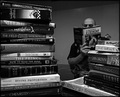
Engulfedby RulerZigzagComment by UrfaK: like the composition.. maybe if the person was filling up more of the background (as in closer) it would have more impact.. |
| Photographer found comment helpful. |
| 11/20/2007 06:10:25 PM |
|
| Photographer found comment helpful. |
| 11/20/2007 04:13:10 PM |
|
| Photographer found comment helpful. |
| 11/20/2007 02:18:57 PM |
|
| Photographer found comment helpful. |
| 11/20/2007 10:39:22 AM |
|
| Photographer found comment helpful. |
| 11/19/2007 12:34:41 AM |
Time for Teaby RulerZigzagComment by Lickety-Splitz: i like the background, it make a good background which pulls all the rest of the colors together(except for the blue teacup rim). a sweet 6 |
| Photographer found comment helpful. |
| 11/16/2007 03:18:43 PM |
|
| Photographer found comment helpful. |
| 11/16/2007 01:47:41 PM |
Time for Teaby RulerZigzagComment by littlegett: First thing I notice are the bland flat unappealing colours. They all really meld together and does not make anything look like something I would want to partake in. I don't care for this angle, maybe a bit lower would add some depth. The counter top I love it has possibility of really adding something. |
| Photographer found comment helpful. |
| 11/16/2007 10:02:25 AM |
Time for Teaby RulerZigzagComment by tjbel05: What ever you used as a backround is very distracting to me. your lighting also seems a little harsh on the left of the cookie. |
| Photographer found comment helpful. |
Home -
Challenges -
Community -
League -
Photos -
Cameras -
Lenses -
Learn -
Help -
Terms of Use -
Privacy -
Top ^
DPChallenge, and website content and design, Copyright © 2001-2026 Challenging Technologies, LLC.
All digital photo copyrights belong to the photographers and may not be used without permission.
Current Server Time: 06/24/2026 12:45:35 PM EDT.