| Image |
Comment |
| 05/03/2006 01:45:08 AM |
Missing Man Formationby MelethiaComment by ericwoo: --Trading Post Comment--
Top 15 finish, very well-done. I think shifting more to your right and cropping off some more of the left would have made it even better. My favorite element in the shot is the texture that the metal sculptures revealed in negative. Very well seen and nicely executed. Congrats on the top 15! |
 Photographer found comment helpful. Photographer found comment helpful. |
| 05/02/2006 11:16:50 PM |
|
| Photographer found comment helpful. |
| 05/02/2006 06:39:50 PM |
Light and shadowby MelethiaComment by tjmueller: Neat choice of colors. Composition is good. I whish the steps would be made out of marble- Ha. Good job and good luck -7- |
| Photographer found comment helpful. |
| 05/02/2006 05:48:30 PM |
|
| Photographer found comment helpful. |
| 05/02/2006 02:51:28 PM |
|
| Photographer found comment helpful. |
| 05/02/2006 12:22:27 PM |
|
| Photographer found comment helpful. |
| 05/02/2006 11:50:08 AM |
|
| Photographer found comment helpful. |
| 05/01/2006 11:55:20 PM |
Light and shadowby MelethiaComment by yantski: The name says it all. I love every thing about this image, the color palette, the textures, the detail, the... |
| Photographer found comment helpful. |
| 05/01/2006 11:08:36 PM |
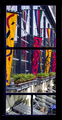
Colorful viewby MelethiaComment by Louis: First impression of this photo for me was strong. I like the bright colours, and the framing matches them well. The vertical banners present the colours well, breaking up the reflective surface of the windows behind them in a pleasing manner.
I likely would have cropped the lower portion out, to omit the portion where the window is split horizontally in two. That area, in my opinion, detracts from the rest of the composition. |
| Photographer found comment helpful. |
| 05/01/2006 09:01:18 PM |
Light and shadowby MelethiaComment by tngrndream: great exposure. right at the edge of burn out (yet not) and right at the edge of black (yet not again). nice subject as well. well done |
| Photographer found comment helpful. |
Home -
Challenges -
Community -
League -
Photos -
Cameras -
Lenses -
Learn -
Help -
Terms of Use -
Privacy -
Top ^
DPChallenge, and website content and design, Copyright © 2001-2026 Challenging Technologies, LLC.
All digital photo copyrights belong to the photographers and may not be used without permission.
Current Server Time: 06/20/2026 11:54:53 AM EDT.