| Image |
Comment |
| 06/16/2006 06:32:22 AM |
|
 Photographer found comment helpful. Photographer found comment helpful. |
| 06/16/2006 05:52:13 AM |
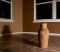
Earth tonesby MelethiaComment by kirsty_mcn: Composition
Nice composition but I'd like to see it a little wider. Not really much to say
Technical stuff (exposure, dof, lighting etc…)
Beautiful lighting, enough to get the nice long shadow which is very important compositionally, but not enough to light the vase too harshly. Seems perfectly exposed, everything else spot on.
Meeting the challenge
Yeah, its wide enough and empty enough to not be a corner so of course
Other
I find the reflections of the frames in the windows distracting. If I were you i'd clone them out.
My personal opinion
If I'd voted on this challenge, I would have picked this out as one of yours. Your shots like this are always so beautiful (as is this one). Great to have a "signature shot" based on fundamental photography skills such as subtle lighting and tones rather than just the content. Pretty impressive that you can score a 6+ and not even make a dent on your profile page! |
| Photographer found comment helpful. |
| 06/16/2006 01:28:37 AM |
|
| Photographer found comment helpful. |
| 06/15/2006 09:56:28 AM |
Rebridgedby MelethiaComment by nards656: ==Trading Post==
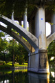
It does look processed, and it does look soft, but I LOVE this use of Gothic glow. It makes for a foggy look, to me, which is nice when combined with a river and a bridge. I also like the green that results. This is a great improvement, IMHO, over the original, but it's so different that it doesn't seem anything like it. Well done. |
| Photographer found comment helpful. |
| 06/15/2006 06:35:22 AM |
|
| Photographer found comment helpful. |
| 06/15/2006 06:34:20 AM |
Stair shadowby MelethiaComment by ubique: Very nicely constructed and presented. There's something slightly dischordant about the right hand side, but I've tried simulating other crops and none are better. So I guess it is what it is after all! And what that is is pretty interesting and satisfying. 7. |
| Photographer found comment helpful. |
| 06/15/2006 12:24:18 AM |
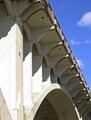
Rebridgedby MelethiaComment by tngrndream: hello again,
i like this shot a lot. the only thing..... for some reason the background looks to be more sharp than the bridge. i am unsure that is truly the case just that is how it appears here.
i like the colors and the angles of the bridge..... one other really cool thing in the photo that works to your advantage really well is that little blue star. that thing holds me in this image.
nicely done. |
| Photographer found comment helpful. |
| 06/15/2006 12:17:44 AM |
Earth tonesby MelethiaComment by tngrndream: hello again,
this is a very nice shot. well done.
i dont really see anything that would make it better. this is a really pleasing image to me. |
| Photographer found comment helpful. |
| 06/14/2006 05:15:26 PM |
Rebridgedby MelethiaComment by Louis: I think there's more to this shot than in the original, which makes it somehow "better". The composition shows off the structure of the bridge very well, and I like the way it thrusts up into the last third of the frame. Very pleasing. The star almost adds a bit of whimsey, but also seems like a focal point, and is an interesting, formalized contrast to the rest of the image, in terms of structure and colour. My only small quibble is with the post-processing, which seems a tad heavy-handed (saturation? contrast? noise reduction?). Otherwise a lovely image well executed. |
| Photographer found comment helpful. |
| 06/14/2006 05:09:31 PM |
Earth tonesby MelethiaComment by Louis: This was one of my favourite images in the challenge. I really like the warmth of the earthy tones and the great shadows generated by the seemingly single light source. I think you've composed this very well, because there is a lot of "reflectivity" in the picture: the two windows, vase versus shadow, angular floor tiles versus nice curved neck of the vase. I think it was a wise choice to clone out the sockets (and litter). Great shot. |
| Photographer found comment helpful. |
Home -
Challenges -
Community -
League -
Photos -
Cameras -
Lenses -
Learn -
Help -
Terms of Use -
Privacy -
Top ^
DPChallenge, and website content and design, Copyright © 2001-2026 Challenging Technologies, LLC.
All digital photo copyrights belong to the photographers and may not be used without permission.
Current Server Time: 08/16/2026 06:23:12 PM EDT.