| Image |
Comment |
| 06/19/2006 10:09:35 AM |
Stair shadowby MelethiaComment by SandyP: Great job, Deb!!! I loved this photo. I has such a clean, abstract look to it! Congratulations on another strong showing! You're awesome :) |
 Photographer found comment helpful. Photographer found comment helpful. |
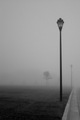
| 06/19/2006 09:31:40 AM |
Fog, lightsby MelethiaComment by dahkota: I've glanced at all the thumb nails and this one jumps out at me. Both a mental and a physical place. Most people, coming up on this scene, would have walked right by searching for a 'lone tree' or a person to put in the image. This 'empty' scene says so much more. thank you. 10 |
| Photographer found comment helpful. |
| 06/19/2006 08:38:00 AM |
Stair shadowby MelethiaComment by dahkota: This one was also one of my top picks. I was sure it would ribbon. Excellent underrated image with more power than people give it credit for. |
| Photographer found comment helpful. |
| 06/19/2006 07:15:59 AM |
Stair shadowby MelethiaComment by aimeethetoo: Congratulations on an excellent score and a near perfect run of 6's. I liked this shot - lots of interesting lines...sort of feels like motion. Great colors too. Good job. Rock on Sister. |
| Photographer found comment helpful. |
| 06/19/2006 05:36:04 AM |
|
| Photographer found comment helpful. |
| 06/19/2006 12:45:43 AM |
|
| Photographer found comment helpful. |
| 06/18/2006 11:50:41 PM |
|
| Photographer found comment helpful. |
| 06/18/2006 11:40:26 PM |
Downtown streetby MelethiaComment by SandyP: Is that mydowntown??? Way to go making it look so awesome! I love those tones. . .but I have never seen one of our downtown streets so empty or photogenic! Great job! |
| Photographer found comment helpful. |
| 06/18/2006 04:57:32 PM |
|
| Photographer found comment helpful. |
| 06/18/2006 04:34:25 AM |
|
| Photographer found comment helpful. |
Home -
Challenges -
Community -
League -
Photos -
Cameras -
Lenses -
Learn -
Help -
Terms of Use -
Privacy -
Top ^
DPChallenge, and website content and design, Copyright © 2001-2026 Challenging Technologies, LLC.
All digital photo copyrights belong to the photographers and may not be used without permission.
Current Server Time: 06/21/2026 09:24:34 PM EDT.