| Image |
Comment |
| 07/03/2006 03:09:16 PM |
|
 Photographer found comment helpful. Photographer found comment helpful. |
| 07/03/2006 03:07:44 PM |
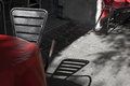
Table chair desatby MelethiaComment by timfythetoo: I like this one too Deb. I actually prefer thios over your entry, but I am not sure if it would have scored much higher (from me it would have). |
| Photographer found comment helpful. |
| 07/03/2006 12:24:50 PM |
|
| Photographer found comment helpful. |
| 07/03/2006 12:24:50 PM |
|
| Photographer found comment helpful. |
| 07/03/2006 11:34:32 AM |
Table chair desatby MelethiaComment by annasense: There's something strangely wonderful about this... nice post-processing, and choice of desat. Really cool. You're not the only one who likes it!!!! |
| Photographer found comment helpful. |
| 07/03/2006 10:22:31 AM |
|
| Photographer found comment helpful. |
| 07/03/2006 02:36:06 AM |
|
| Photographer found comment helpful. |
| 07/03/2006 01:19:38 AM |
|
| Photographer found comment helpful. |
| 07/03/2006 01:05:57 AM |
Three generationsby MelethiaComment by SandyP: I love it! I love the title. It says it all. That bright, perfectly crisp yellow flower really pops against the white background. I love the contrast of the life, the one that hasn't even opened up. . .and the one that's already died. Great work! |
| Photographer found comment helpful. |
| 07/03/2006 12:45:16 AM |
Joe's Fruit and Vegetablesby MelethiaComment by SandyP: Oh, I LOVE this photo! There is not one thing you needed to do to this perfect photo editing wise. It's razor sharp. The colors are incredibly vibrant. . .but what I love the most is the composition and subject! It has a lovely, nostalgic feel to it that just feels good to look at it! I hope this does well because it's one of my favorites! |
| Photographer found comment helpful. |
Home -
Challenges -
Community -
League -
Photos -
Cameras -
Lenses -
Learn -
Help -
Terms of Use -
Privacy -
Top ^
DPChallenge, and website content and design, Copyright © 2001-2026 Challenging Technologies, LLC.
All digital photo copyrights belong to the photographers and may not be used without permission.
Current Server Time: 06/22/2026 07:27:36 AM EDT.