| Image |
Comment |
| 07/15/2006 04:58:15 PM |
|
 Photographer found comment helpful. Photographer found comment helpful. |
| 07/13/2006 11:19:48 PM |
|
| Photographer found comment helpful. |
| 07/13/2006 10:53:35 PM |
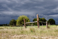
Corner postsby MelethiaComment by timfythetoo: Trading post - The posts surely arent moving now - but who knows when that storm comes through. Easily met the challenge and the contrast between the posts andthe sky is nice. But my eyes are really drawn to the clouds. They are the focal point for me - and they are cool. Would be nice to see another version of this with a nice blue sky with poofy clouds. Good focus and detasil through out and the lighting onthe foregournd is really quite good considering the sky in the background. Top 50 out of almost 300 is great. Good work Deb. |
| Photographer found comment helpful. |
| 07/13/2006 10:47:15 PM |
Three generationsby MelethiaComment by timfythetoo: Trading post - Darned cat (I should know - I have three of em). Good comp on this shot. Th e three stages offer good interest. The main flower seems a bit soft - wish it was sharp through out the whole bud. A bit more saturation may have also allowed all three to stand out a bit stronger against the white background. Seems a bit light overall. I think you have a great idea and basic setup here, a couple of tweaks could have made this image stand out even more. |
| Photographer found comment helpful. |
| 07/13/2006 10:43:20 PM |
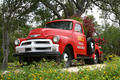
Joe's Fruit and Vegetablesby MelethiaComment by timfythetoo: Trading Post - Cool angle, great colors, good sharpness and an overall intersting model. Would like to see this postprocessed with the colors of the truck slightly exagerated. Good job. |
| Photographer found comment helpful. |
| 07/13/2006 10:38:38 PM |
Corner postsby MelethiaComment by Kelli: Trading post...
An under rated shot! I gave this an 8 in voting. I liked the starkness of the posts against the dramatic sky. I really loved the small red/orange flowers at the bottom of the posts amongst the dead/dying grass. Great find! |
| Photographer found comment helpful. |
| 07/13/2006 12:11:47 PM |
|
| Photographer found comment helpful. |
| 07/13/2006 12:01:15 PM |
|
| Photographer found comment helpful. |
| 07/13/2006 11:59:58 AM |
|
| Photographer found comment helpful. |
| 07/13/2006 11:57:52 AM |
Quiet Progressionby MelethiaComment by Kavey: I like this mix of man-made barriers being used by nature as it carries on it's inexorable growth. Great background too and composition works. |
| Photographer found comment helpful. |
Home -
Challenges -
Community -
League -
Photos -
Cameras -
Lenses -
Learn -
Help -
Terms of Use -
Privacy -
Top ^
DPChallenge, and website content and design, Copyright © 2001-2026 Challenging Technologies, LLC.
All digital photo copyrights belong to the photographers and may not be used without permission.
Current Server Time: 06/22/2026 06:04:47 PM EDT.