| Image |
Comment |
| 03/18/2004 05:00:20 PM |
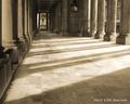
Pillars IIby KaveyComment by justine: This one is my favorite Kavey.
I like the shadows/light of course, but the contrasting/tones makes this much more appealing. The dof/pov helps to make an interesting study.
I do the same (eyedropper)..I think you've done this one just right. |
 Photographer found comment helpful. Photographer found comment helpful. |
| 03/18/2004 04:52:08 PM |
Pillars IIby KaveyComment by Kavey: Thanks folks...
Thamer, the border colour for each photo in this series is actually different - I used the eyedropper to lift a colour from the image. Perhaps I should have sampled a different area/ tone within this one. |
| 03/18/2004 04:49:02 PM |
Pillars IIby KaveyComment by amsmyth: I like this one better on a second look but I would have preferred to see it close/move in on the structure and rich elements at the end. Would this be helped with a little cropping? |
| Photographer found comment helpful. |
| 03/18/2004 04:49:01 PM |
Pillars IIby KaveyComment by tyt2000: Aside from that rain drop :) I really love the perspective here, its very deep and leads the eye to the exit. The light's exposure is well balanced and combined with the shadows, they make a wonderful pattern. The tone is very beautiful and fits very well with the atmosphere of the place.
Being picky: The border's color doesn't match that much with the photo, it looked much better in the previous photo. A black border would look good too. But sometimes the photo is so powerful that it doesn't need a border.
A beautiful photo overall, I would give it a 10!
Good luck :) |
| Photographer found comment helpful. |
| 03/18/2004 04:46:54 PM |
|
| Photographer found comment helpful. |
| 03/18/2004 04:43:12 PM |
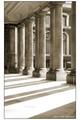
Pillars I (white border)by KaveyComment by tyt2000: I really like the perspective and how the shadows are in the frame. The light is a little bit overexposed (if I was to be picky). I love the tone, its very beautiful and fits well with the atmosphere of the scene. Nice choice of border too. I would give it a 9
Great photo overall...
Good luck :) |
| Photographer found comment helpful. |
| 03/18/2004 04:19:19 PM |
Pillars IIby KaveyComment by faidoi: 9b.jpg "9" maybe upgrade to "10" right on the border. Also excellent tone. Cropping would make a different here. Maybe a bit on the bottom also. |
| Photographer found comment helpful. |
| 03/18/2004 04:18:55 PM |
Pillars I (white border)by KaveyComment by faidoi: 8c.jpg is totally awesome. "10" I like the tone. Excellent contrast. Maybe cut a bit off the very bottom. I don't know which one you entered but this one is very good. |
| Photographer found comment helpful. |
| 03/18/2004 03:50:17 PM |
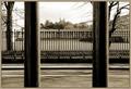
.by KaveyComment by BAMartin: This is a very good photograph for this challenge because there are so many interesting parallel lines. I love the way the two closeup bars frame the building in the far distance, and also how they are mirrored by the trees (a shame that the tree on the right is cut off a bit, would have been better if the entiree tree as visible). Sepia is well suited for this photograph as it lends an old time feeling to the scene, and also saved what looks like a washed out sky.
Other than the tree being cut in half, the only other impovement that I would suggest is maybe more DOF so that the close bars are more in focus, although being a little soft does not bother me too much. |
| Photographer found comment helpful. |
| 03/18/2004 09:45:37 AM |
.by KaveyComment by robsmith: Great capture, where ever I look there are parallel lines. Superb symmetry and letting the sky burn out accents the railings. |
| Photographer found comment helpful. |
Home -
Challenges -
Community -
League -
Photos -
Cameras -
Lenses -
Learn -
Help -
Terms of Use -
Privacy -
Top ^
DPChallenge, and website content and design, Copyright © 2001-2026 Challenging Technologies, LLC.
All digital photo copyrights belong to the photographers and may not be used without permission.
Current Server Time: 07/16/2026 08:59:23 AM EDT.