| Image |
Comment |
| 04/01/2004 09:58:46 AM |
|
 Photographer found comment helpful. Photographer found comment helpful. |
| 04/01/2004 05:53:37 AM |
|
| Photographer found comment helpful. |
| 04/01/2004 12:59:14 AM |
|
| Photographer found comment helpful. |
| 03/23/2004 10:19:32 PM |
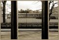
.by KaveyComment by moodville: Great toning. Wonderful natural framing of the structure in the background, but also great use of layers with the columns/poles, fence, and then structure. Lots of parallel lines going on here! Nicely seen and captured. |
| Photographer found comment helpful. |
| 03/23/2004 03:39:24 PM |
.by KaveyComment by justine: You have met the challenge. I do think you could of cropped this tighter to give it some drama. |
| Photographer found comment helpful. |
| 03/23/2004 04:03:32 AM |
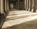
.by KaveyComment by Rasai: The blurry pillars in the foreground distract from the picture for me, especially |
| Photographer found comment helpful. |
| 03/22/2004 07:04:10 PM |
.by KaveyComment by obstetrify: I like the two parallels on this side of the road, which counterpoint the railings across the road. The building in the distanace looks a bit like the Royal Observatory at Greenwich, am I right. This is nice. |
| Photographer found comment helpful. |
| 03/20/2004 10:36:00 PM |
.by KaveyComment by Cam: Cool photo......I really think the fence and the awesome background would have been sufficiant though. The poles are a bit too much...nice photo none the less..good luck. |
| Photographer found comment helpful. |
| 03/20/2004 04:01:28 PM |
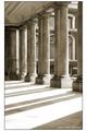
Pillars I (white border)by KaveyComment by Bibliophile: 9, I very much like the pillars and their shadows. It's a strong composition with nice tones. The only thing I don't like is the building in the back. I know you have no control over that, but somehow it detracts from the power nad strength of the pillars. The round windows are also trying very hard to steal the focus, although you've kept them in their place!
Personnally, I don't think the border adds anything, I would have kept it a simple black line. Message edited by author 2004-03-20 16:02:34. |
| Photographer found comment helpful. |
| 03/20/2004 03:59:10 PM |
Pillars IIby KaveyComment by Bibliophile: I'd go with an 8 on this one. Nice tone and subjects, but at the same time it's a little dry. I can't really tell you why I'm not connecting with this image, but there's no emotion to it for me. Technically sound, but I don't like the crop the focus is too much on the empty space and not enough on the 'parallel' pillars. |
| Photographer found comment helpful. |
Home -
Challenges -
Community -
League -
Photos -
Cameras -
Lenses -
Learn -
Help -
Terms of Use -
Privacy -
Top ^
DPChallenge, and website content and design, Copyright © 2001-2026 Challenging Technologies, LLC.
All digital photo copyrights belong to the photographers and may not be used without permission.
Current Server Time: 07/16/2026 03:59:42 AM EDT.