| Image |
Comment |
| 05/02/2005 01:32:31 AM |
The sadness of a carnival workerby drake217Comment by mpemberton: Nice photo, looks more like what the H*ll. The lack of detail in the face (objectively speaking) could of been fixed with a tighter photo. The rest of the picture overrides the target. I would of moved him to the right, or cropped him right. The viewer's right. 6. |
| 05/02/2005 01:22:55 AM |
|
| 05/01/2005 05:22:05 PM |
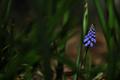
Grape Hyacinthby drake217Comment by nico_blue: wonderful contrast between the blue and green +brown around it. Nice composition as well... on the left it looks the leaves look a bit smudged for some reason especially since there are some that are in focus which accentuate the differences between them, i think i would suggest just blurring everything on the left. good image though. 8 |
 Photographer found comment helpful. Photographer found comment helpful. |
| 05/01/2005 02:19:15 PM |
|
| 05/01/2005 03:20:36 AM |
Grape Hyacinthby drake217Comment by akshayvh: While I like the choice of your subject and colors, I find the blades surrounding it distracting.. a different angle might have helped..6. |
| 05/01/2005 02:55:59 AM |
|
| 04/30/2005 09:48:51 PM |
Grape Hyacinthby drake217Comment by JPR: Nice DOF here, gives the feeling that it was found as a surprise and gives a feeling of the environment it is in. Some people might tell you that the photo is too dark. I like dark and think you did an excellent job with the exposure and processing. |
| 04/30/2005 03:07:20 PM |
|
| 04/30/2005 05:14:43 AM |
|
| 04/30/2005 12:48:43 AM |
|
Home -
Challenges -
Community -
League -
Photos -
Cameras -
Lenses -
Learn -
Help -
Terms of Use -
Privacy -
Top ^
DPChallenge, and website content and design, Copyright © 2001-2026 Challenging Technologies, LLC.
All digital photo copyrights belong to the photographers and may not be used without permission.
Current Server Time: 07/16/2026 01:30:43 AM EDT.