To The Bottomby
fplouffeComment by joezl: Hello from the Critique Club
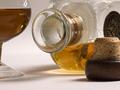
Well done on a great image. This is a well put together image that fits the theme as several commentators have said. The lighting is great, the background is clear and the lighting is well done, particularly the warm glow below the bottle.
Why did such a good image not perform better in the contest?
The multiple reflections are an obvious potential issue. I'm sure some people liked them while others did not. My overall feel is that the image is a bit too cluttered. I'm not sure the cork top adds much to the overall effect (in itself, it's not really an object of beauty) and yet it's quite intrusive in the foreground. Further experimenting with lighting, maybe more side-lighting with the creation of some darker shadows, would have given this a different mood.
As matters of detail, the glass is not a whiskey glass and the liquid in the glass is a different colour to the liquid in the bottle. These are not major points but would probably matter if you were submitting this for stock or something similar.
I suspect that the reason this did not do better is that, while being a very clean, well-executed image, it lacks something to give it an emotional punch as soon as people look at it (for instance, the stronger lighting as suggested above). It's almost too clean - nearly sterile. That may be part of the objective here as you don't want to romanticise drinking in the context of this challenge. But I suspect that this may have held it back leading commentators to say 'nice image' rather than 'WOW'.
Overall a great image which probably should have scored higher.