| Image |
Comment |
| 05/09/2006 04:16:32 PM |
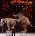
The Circus in townby DigiFotoBuddyComment by Oddfrog: Hi from the CTP2 blub:)
I like this pic:)
The composition is good.
I like the contrast of the lighting and also between the size of the elephants ant the trainer.
Good focus.
Maybe sharpeing could help a bit but that could just be me...
Nice one:) |
 Photographer found comment helpful. Photographer found comment helpful. |
| 05/09/2006 02:35:00 PM |
|
| Photographer found comment helpful. |
| 05/09/2006 02:26:47 PM |
Rhythmic Curvesby DigiFotoBuddyComment by JUSTCALLMELADY: interesting with the repetiton of the spirals as well as the reflection of the entire peice. I'm not sure what you used as a backround here but it works well. |
| Photographer found comment helpful. |
| 05/09/2006 02:07:58 PM |
|
| Photographer found comment helpful. |
| 05/09/2006 01:51:41 PM |
|
| Photographer found comment helpful. |
| 05/09/2006 12:14:43 PM |
|
| Photographer found comment helpful. |
| 05/09/2006 11:16:03 AM |
|
| Photographer found comment helpful. |
| 05/09/2006 10:08:33 AM |
|
| Photographer found comment helpful. |
| 05/09/2006 06:19:15 AM |
|
| Photographer found comment helpful. |
| 05/09/2006 06:09:12 AM |
Rhythmic Curvesby DigiFotoBuddyComment by san62910: I've looked at this several times and still not sure what it is, but I love the curves and the way it draws the eye across the photo. Great color. Not so fond of the background though. |
| Photographer found comment helpful. |
Home -
Challenges -
Community -
League -
Photos -
Cameras -
Lenses -
Learn -
Help -
Terms of Use -
Privacy -
Top ^
DPChallenge, and website content and design, Copyright © 2001-2026 Challenging Technologies, LLC.
All digital photo copyrights belong to the photographers and may not be used without permission.
Current Server Time: 07/18/2026 04:58:55 AM EDT.