| Image |
Comment |
| 05/19/2006 01:05:12 AM |
Selfby DigiFotoBuddyComment by liltritter: Honestly, I never cared for red backgrounds. However, it works with this shot and I like it. |
 Photographer found comment helpful. Photographer found comment helpful. |
| 05/19/2006 12:43:45 AM |
|
| Photographer found comment helpful. |
| 05/19/2006 12:05:45 AM |
|
| Photographer found comment helpful. |
| 05/18/2006 10:25:27 PM |
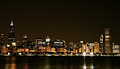
C.H.I.C.A.G.O.by DigiFotoBuddyComment by Rebecca: Hi Shailesh from Rebecca of your CTP2 group!
Ahh, Chicago... I'm almost but not really from there, and seeing that familiar skyline tugs at my heart ;-)
I like the reflection on the water, subtle but very nice. The image isn't quite sharp, and I wonder if the tripod was shaking a bit? Chicago isn't called the Windy City for nothing. I would have moved the vantage to the right just a touch, so the CPD-lit building on the right border isn't cut off at all, and so the Sears Tower at the left side is a little closer to that border without touching it. I would crop out some of the sky so that there is the same amount of sky above the Sears Tower as there is water in the bottom of the photo, to give it a more balanced, panoramic feel. There is also a fair bit of noise visible in the sky, so a pass through NI to clean that up wouldn't hurt. |
| Photographer found comment helpful. |
| 05/18/2006 06:38:23 PM |
|
| Photographer found comment helpful. |
| 05/18/2006 11:41:15 AM |
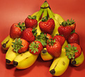
Strawberry Bananaby DigiFotoBuddyComment by Ken: The background color works well with the strawberries. An improvement would be more "perfect" bananas that are pure yellow (if you could find them!). |
| Photographer found comment helpful. |
| 05/18/2006 09:07:57 AM |
|
| Photographer found comment helpful. |
| 05/18/2006 05:06:05 AM |
Strawberry Bananaby DigiFotoBuddyComment by raish: Meets challenge for sure. Cute. Post processing (or maybe your lighting) has cost texture - it looks too glossy and plastic. 6+ |
| Photographer found comment helpful. |
| 05/18/2006 01:26:27 AM |
Strawberry Bananaby DigiFotoBuddyComment by General: i will say you had a great photograph here in terms of lighting, color but composition is not that great , i will say you don't do justice to your vision, 8 |
| Photographer found comment helpful. |
| 05/18/2006 12:16:33 AM |
|
| Photographer found comment helpful. |
Home -
Challenges -
Community -
League -
Photos -
Cameras -
Lenses -
Learn -
Help -
Terms of Use -
Privacy -
Top ^
DPChallenge, and website content and design, Copyright © 2001-2026 Challenging Technologies, LLC.
All digital photo copyrights belong to the photographers and may not be used without permission.
Current Server Time: 07/18/2026 09:53:41 AM EDT.