| Image |
Comment |
| 07/03/2006 12:37:35 AM |
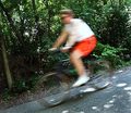
The Bicyclistby DigiFotoBuddyComment by Rebecca: Hi Shailesh-
I think what hurts this photo most is that the background is too busy. It's the only part of the photo in focus, so we search on it for a place of interest and find nothing, and the biker is there but somehow seems secondary to the leaves. It would work better with a plain background. Also, the lighting is natural, but too white. Shooting when the sun is low in the sky will give an outdoor subject a nice photogenic golden glow. |
 Photographer found comment helpful. Photographer found comment helpful. |
| 07/03/2006 12:22:26 AM |
|
| Photographer found comment helpful. |
| 07/02/2006 11:06:38 PM |
|
| Photographer found comment helpful. |
| 07/02/2006 10:58:30 PM |
|
| Photographer found comment helpful. |
| 07/02/2006 07:51:49 PM |
|
| Photographer found comment helpful. |
| 07/02/2006 02:40:26 PM |
|
| 07/02/2006 02:34:15 PM |
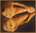
Take2_Alternate_PPby DigiFotoBuddyComment by BeeCee: I agree. The red was strong enough that the shells almost seemed to sink into it, if that makes any sense? Now they rise above the darker, inviting me to look more closely.
The border matches well, but it seems to crowd the shells so that when my eye gets to the end of the shell it's grabbed by the border and taken off that direction. A very narrow one would be nicer, IMO.
The shells are gorgeous, btw, and the lighting really exposes all the fine detail well. :) |
| Photographer found comment helpful. |
| 07/02/2006 01:54:32 PM |
Take2_Alternate_PPby DigiFotoBuddyComment by Beetle: I prefer this one because there is more contrast between subject and color. I hate the border. If you MUST have one, make it much smaller.
Edited after the border was changed: much much better :-) Message edited by author 2006-07-03 00:22:10. |
| Photographer found comment helpful. |
| 07/01/2006 06:13:08 PM |
|
| Photographer found comment helpful. |
| 06/29/2006 03:32:47 PM |
|
| Photographer found comment helpful. |
Home -
Challenges -
Community -
League -
Photos -
Cameras -
Lenses -
Learn -
Help -
Terms of Use -
Privacy -
Top ^
DPChallenge, and website content and design, Copyright © 2001-2026 Challenging Technologies, LLC.
All digital photo copyrights belong to the photographers and may not be used without permission.
Current Server Time: 07/22/2026 06:50:25 PM EDT.