| Image |
Comment |
| 07/06/2006 12:13:22 AM |
|
 Photographer found comment helpful. Photographer found comment helpful. |
| 07/05/2006 11:21:48 PM |
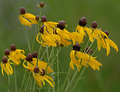
Flower Danceby DigiFotoBuddyComment by ursula: One of my favourites of the challenge, so beautiful, great title too. This is how wildflowers look out there on a breezy day! (10) |
| Photographer found comment helpful. |
| 07/05/2006 04:22:29 PM |
|
| Photographer found comment helpful. |
| 07/05/2006 10:19:30 AM |
The Bicyclistby DigiFotoBuddyComment by DigiFotoBuddy: Originally posted by yanko:
I agree with Rebecca 100%. The subject simply doesn't stand out against that highly detailed background. Oh and what's with the I just want to meet my average comment? You gotta reach higher than that! Come to think of it you're probably just trying to get your average down so you can take most improved photographer again in season 2. :P |
You got the idea. ;) Just kidding.. I seriously thought it would score close to my current average. |
| 07/05/2006 06:32:41 AM |
The Bicyclistby DigiFotoBuddyComment by yanko: I agree with Rebecca 100%. The subject simply doesn't stand out against that highly detailed background. Oh and what's with the I just want to meet my average comment? You gotta reach higher than that! Come to think of it you're probably just trying to get your average down so you can take most improved photographer again in season 2. :P |
| Photographer found comment helpful. |
| 07/04/2006 11:04:48 PM |
|
| Photographer found comment helpful. |
| 07/04/2006 04:35:35 PM |
Flower Danceby DigiFotoBuddyComment by macrothing: 6 - Nice unique image. Good concept. A variation in composition, perhaps with a little more space to each sides, may have made this even better in my opinion. |
| Photographer found comment helpful. |
| 07/04/2006 01:54:39 PM |
Flower Danceby DigiFotoBuddyComment by saracat: This seems to have a melancholy feel to it - like the winds of autumn are coming and this is the last day that the petals will be yellow. It's very moving, actually. I like it. |
| Photographer found comment helpful. |
| 07/04/2006 05:47:11 AM |
|
| Photographer found comment helpful. |
| 07/03/2006 10:32:20 PM |
|
| Photographer found comment helpful. |
Home -
Challenges -
Community -
League -
Photos -
Cameras -
Lenses -
Learn -
Help -
Terms of Use -
Privacy -
Top ^
DPChallenge, and website content and design, Copyright © 2001-2026 Challenging Technologies, LLC.
All digital photo copyrights belong to the photographers and may not be used without permission.
Current Server Time: 07/21/2026 06:56:35 AM EDT.