| Image |
Comment |
| 02/15/2003 11:18:27 AM |
Love Scornedby togtogComment by Jacko: lol. Great idea. The whole picture seems to lack sharpness but I like the composition. Good job. Very different. |
 Photographer found comment helpful. Photographer found comment helpful. |
| 02/15/2003 09:59:52 AM |
|
| Photographer found comment helpful. |
| 02/15/2003 09:17:13 AM |
Love Scornedby togtogComment by langdon: Nicely shot, the lighting works well for the pencil and shadow. The framing and composure is perfect. |
| Photographer found comment helpful. |
| 02/15/2003 05:51:35 AM |
|
| Photographer found comment helpful. |
| 02/15/2003 02:31:04 AM |
|
| Photographer found comment helpful. |
| 02/09/2003 10:55:58 PM |
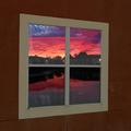
Reflection of days endby togtogComment by ambaker: Critique Club Review
Great Colors! The angle of the window against the lines of the blocks surrounding it, seems a bit off to me. Perhaps cropping closer to the window itself, or a more "head on" angle would help. About the only other thing I notice is that the focus on the window seems softer than the scene within.
It is hard to recommend much here, as this is already a very good photo. |
| Photographer found comment helpful. |
| 02/09/2003 08:27:42 PM |
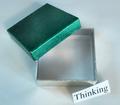
Something Too Rareby togtogComment by KarenB: Critique Club Assignment:
Initial: Good idea!
Composition: Placement of the objects is done well. Green attracts the eye, which is then led to the open box, and then down to the sign.
Technical: The background should be whiter.. perhaps better lighting and increasing the exposure value would be helpful if you have the ability to do that.
Overall: I like it, and personally scored it well because of the idea. Still, it would've scored higher if the technical aspects were tuned better. Great job! Look forward to more! ;0) |
| Photographer found comment helpful. |
| 02/09/2003 05:19:47 AM |
Reflection of days endby togtogComment by togtog: I would like to thank everyone for their comments. The way I made the above picture was; I took a new picture of my brothers bedroom window from outside. I then cut out the glass parts, and added the sunset photo (that I took a few months ago) as the layer under that. I then blurred the edges of the window panes to blend them with the sunset, so it didn't look as edited. I then darkened the bottom two panes in another layer to look like the screen, and added the fogging in yet another layer. I think the over all look is pleasing and what I wanted, but I wish I would have rotated the sunset slightly to align it better.
Thank you again for your helpful comments, I hope to learn from them and do better the next time. Cheers!
|
| 02/02/2003 09:46:15 PM |
Reflection of days endby togtogComment by sher: lovely sunset...great colors. i notice a dark like on the right side of each of the bottom panes...a bit distracting to me. otherwise, a beautiful photo. |
| Photographer found comment helpful. |
| 02/02/2003 09:16:23 PM |
|
| Photographer found comment helpful. |
Home -
Challenges -
Community -
League -
Photos -
Cameras -
Lenses -
Learn -
Help -
Terms of Use -
Privacy -
Top ^
DPChallenge, and website content and design, Copyright © 2001-2026 Challenging Technologies, LLC.
All digital photo copyrights belong to the photographers and may not be used without permission.
Current Server Time: 07/16/2026 10:21:03 AM EDT.