| Image |
Comment |
| 12/22/2004 10:17:49 AM |
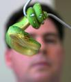
Cold Bloodedby brockmdComment by Rankles: Very cool shotm well focused, and great composition. A darker background would have been nice though. |
| 12/22/2004 08:34:13 AM |
|
| 12/22/2004 07:20:40 AM |
|
| 12/22/2004 03:46:02 AM |
|
| 12/22/2004 01:04:03 AM |
Cold Bloodedby brockmdComment by totaldis: great picture, it's a shame a lot of people are going to score the classic dog, cat, pet pics higher cause of the 'cuddling factor'. |
| 12/21/2004 10:35:27 PM |
Exhaleby brockmdComment by Gatorguy: Your photo meets the wind challenge, but I think there are a few problems, at least in my opinion. Please take this both as constructive and as one person's opinion.
1. The models skin tone is yellow-green - not a very pleasant color for skin. Maybe your white balance was off, or your were catching ambient light reflecting from some other object.
2. There is bad glare on glasses. Couldn't she have removed them for the shot. If not, the lighting or the head angle will have to be adjusted.
3. The wrinkled backdrop is a distraction. If you can't use a different one, or press the one you've got, maybe you could move the model and candle farther away so you can blur it out with DOF.
I'm giving you a 5 |
| 12/21/2004 11:28:11 AM |
|
| 12/18/2004 03:05:52 AM |
Exhaleby brockmdComment by Prof_Fate: The backdrop is wrinkly. her glasses are reflecting something too bright - remove the glasses to remove a distracting element. Your white balance seeems off - or she has jaundice. The writing on the shirt is also a distraction - basic compositional rule: unless it adds to the picture's meaning/intent, then it should not be there. The red shirt goes with the red candle, but the words? Perhaps a closer crop, lower the modle's head a bit OR have her turn to face the camera at about a 45 degree angle... |
 Photographer found comment helpful. Photographer found comment helpful. |
| 12/17/2004 10:43:16 PM |
Exhaleby brockmdComment by sailracer_98: I think this is a great idea. I have a few suggestions on how I think this photo might be improved. First, I would make the background darker and/or blur it with a shallow DOF. Second, the white balance looks like it wasn't set correctly rendering the smoke, the skin and everything else yellow. I'm guessing this was shot with tungsten lighting but the camera's white balance setting was not changed to match. Third, the writing on the shirt is distracting and should probably be cropped out. I think some or all of these changes would result in a very striking photo. |
| Photographer found comment helpful. |
| 12/16/2004 11:05:22 PM |
|
| Photographer found comment helpful. |
Home -
Challenges -
Community -
League -
Photos -
Cameras -
Lenses -
Learn -
Help -
Terms of Use -
Privacy -
Top ^
DPChallenge, and website content and design, Copyright © 2001-2026 Challenging Technologies, LLC.
All digital photo copyrights belong to the photographers and may not be used without permission.
Current Server Time: 07/16/2026 03:30:51 AM EDT.