| Image |
Comment |
| 10/17/2007 10:28:38 PM |
|
| 10/17/2007 09:44:42 PM |
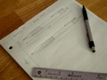
An Engineer's Toolby Cobra517Comment by Tammer: Not a bad composition. The colors seems a little...flat/dull. Perhaps a bit more lighting or saturation would make it more effective for me. |
 Photographer found comment helpful. Photographer found comment helpful. |
| 10/17/2007 02:29:26 PM |
|
| 10/17/2007 01:29:14 PM |
An Engineer's Toolby Cobra517Comment by haircut: I like the idea and your design sketches, I think the image needs more contrast. If you brightened it up to make the paper more bright it would have helped. |
| Photographer found comment helpful. |
| 10/17/2007 12:11:38 PM |
|
| 10/17/2007 08:43:19 AM |
|
| 10/17/2007 04:36:34 AM |
|
| 10/17/2007 01:49:14 AM |
|
| 11/23/2004 07:33:56 PM |
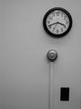
Simply black and whiteby Cobra517Comment by pcody: The form and texture are there. I think it would be more pleasing if the composition was futher over to the left. Maybe because I'm used to reading left to right? The pattern the three items make is interesting. |
| 11/23/2004 06:13:37 PM |
|
Home -
Challenges -
Community -
League -
Photos -
Cameras -
Lenses -
Learn -
Help -
Terms of Use -
Privacy -
Top ^
DPChallenge, and website content and design, Copyright © 2001-2026 Challenging Technologies, LLC.
All digital photo copyrights belong to the photographers and may not be used without permission.
Current Server Time: 07/15/2026 11:02:14 PM EDT.