| Image |
Comment |
| 11/17/2004 02:00:29 AM |
|
 Photographer found comment helpful. Photographer found comment helpful. |
| 11/17/2004 12:27:06 AM |
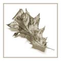
Black and whiteby JondorComment by deapee: Good composition, nice and simple. Great use of blank space -- and I absolutely love the framing (and I usually don't like borders too much), really good idea...great shot, great presentation! |
| Photographer found comment helpful. |
| 11/16/2004 04:58:41 AM |
Novemberby JondorComment by Jondor: First of all I would like to thank everybody for their comments.
For those who have problems with borders: Usually I keep my borders simple, a single line with some white or black depending on the content. But this is because I usually do stillifes with a modern and very minimalistic style. The simple border matches that. A Rembrand of Vermeer needs a heavy golden frame to match the tast of the period.
This image tried to go back to the pen drawings from before the camera and the border had to match this.
So for those who just don't like borders because they are borders: please try to imagine why it is there and what it tries to accomplice. Just comment that it would be so much better without (as the first comment did) simply will not do! |
| 11/15/2004 06:59:06 AM |
Novemberby JondorComment by Artyste: This was my only 10 of the challenge, a lovely and extremely simple shot, and worthy of a yearly botany calender :) |
| Photographer found comment helpful. |
| 11/14/2004 11:09:43 AM |
|
| Photographer found comment helpful. |
| 11/13/2004 09:43:03 PM |
|
| Photographer found comment helpful. |
| 11/12/2004 07:03:57 PM |
Novemberby JondorComment by Kavey: Far and away my favourite entry in this challenge. I love the lighting, the grainy texture, the toning and the clean background. Only thing I'm not keen on is choice of border. Beautiful, elegant, simple image. |
| Photographer found comment helpful. |
| 11/12/2004 02:07:43 PM |
Novemberby JondorComment by Blackdog: Very simple, very elegant. The duotone is excellent. The shadow is good, it gives it a 3D effect. The grain adds interest and gives atmosphere AND I think the border is wonderful, very nice touch. Well done a six from me. |
| Photographer found comment helpful. |
| 11/12/2004 01:14:31 AM |
Novemberby JondorComment by KDO: Simple elegance. An entire calendar using this style would be amazing. |
| Photographer found comment helpful. |
| 11/11/2004 06:54:13 PM |
Novemberby JondorComment by soup: keep the border simple.
intresting entry - i like it.
good luck |
| Photographer found comment helpful. |
Home -
Challenges -
Community -
League -
Photos -
Cameras -
Lenses -
Learn -
Help -
Terms of Use -
Privacy -
Top ^
DPChallenge, and website content and design, Copyright © 2001-2026 Challenging Technologies, LLC.
All digital photo copyrights belong to the photographers and may not be used without permission.
Current Server Time: 07/17/2026 05:40:46 PM EDT.