| Image |
Comment |
| 04/29/2005 11:16:59 AM |
|
 Photographer found comment helpful. Photographer found comment helpful. |
| 04/29/2005 08:18:00 AM |
|
| 04/29/2005 05:53:03 AM |
|
| Photographer found comment helpful. |
| 04/28/2005 10:07:52 PM |
7:32:26 PMby codauberComment by davidphotography: This is very interesting. I like the concept, although i am still figuring that out. .I don't know how you did it...but very cool. |
| Photographer found comment helpful. |
| 04/28/2005 07:24:02 PM |
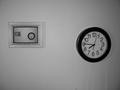
7:32:26 PMby codauberComment by jmlelii: The lighting in the image is very flat, and as a result the entire image has suffered from it. It was clever how you used a mirror on the wall to reflect off a mirror you are holding to reflect the clock on the wall. Based on technicalities, I would only give this a 4, though you're cleverness has bumped it to a 5. Good luck. |
| Photographer found comment helpful. |
| 04/28/2005 05:15:22 PM |
7:32:26 PMby codauberComment by DustDevil: I love the concept and I think you pulled it off very well. I do not like the reflections on the wall in the lower right or the cord. But I still gave it a 7. |
| Photographer found comment helpful. |
| 04/28/2005 01:31:37 PM |
|
| 04/28/2005 01:02:21 PM |
7:32:26 PMby codauberComment by Tiberius: I don't get the idea thoigh it looks interesting. The fram on the wall is far from my tastes and spoils the pic. The b&w convestion is washed out and there are too much greys. The angle on the clock is not very good. I would have tried to avoid it. The title does not influence my vote but I cannot get it either. I appreciate that you took some time for the set up and tried smth diff. Hope it helps and Good luck! |
| 04/28/2005 12:44:21 PM |
|
| Photographer found comment helpful. |
| 04/28/2005 12:42:07 PM |
|
Home -
Challenges -
Community -
League -
Photos -
Cameras -
Lenses -
Learn -
Help -
Terms of Use -
Privacy -
Top ^
DPChallenge, and website content and design, Copyright © 2001-2026 Challenging Technologies, LLC.
All digital photo copyrights belong to the photographers and may not be used without permission.
Current Server Time: 07/16/2026 06:54:24 AM EDT.