| Image |
Comment |
| 04/28/2005 12:43:11 PM |
|
 Photographer found comment helpful. Photographer found comment helpful. |
| 04/27/2005 10:49:39 PM |
|
| Photographer found comment helpful. |
| 04/27/2005 10:48:39 PM |
|
| Photographer found comment helpful. |
| 04/27/2005 08:11:47 PM |
Crystal, stone and lightby rbennyComment by eqsite: An interesting idea. I'm guessing that the placement of the shadow was intentional, but I'm not sure what the intent was. The transition from light to dark in the middle of the frame just seems distracting to me. |
| Photographer found comment helpful. |
| 04/27/2005 05:57:00 PM |
|
| Photographer found comment helpful. |
| 04/27/2005 09:49:39 AM |
|
| Photographer found comment helpful. |
| 04/27/2005 03:06:25 AM |
Crystal, stone and lightby rbennyComment by Zed Pobre: If that's supposed to be a crystal marble, I think you got ripped off. The light from it is dull, making it look like tarnished glass, plastic, or resin. The texture of the stone is nice, as is the shadow, and the red... something... adds an interesting note to the subject. |
| Photographer found comment helpful. |
| 04/18/2005 03:49:43 PM |
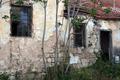
Glorious Pastby rbennyComment by docurrie: I think a touch of saturation would have made the colors more vibrant. Perhaps cropping or altering shot so tree was in the middle would have kept it from ditracting from the shot. Perhaps it could have framed the right side of the building better. |
| Photographer found comment helpful. |
| 04/18/2005 10:11:45 AM |
Glorious Pastby rbennyComment by KarANN: This is very pretty! I lobe this shot , the building is very cute and the grass and vines look neat. |
| Photographer found comment helpful. |
| 04/18/2005 12:15:56 AM |
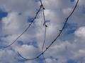
Nubladoby rbennyComment by HBunch: *Critique Club*
Very elegant N. Kind of like it's in a fancy font. I like the N. I see a comment that says 'more close up to get the N'. I have to disagree with that comment. If you were any closer, you would be cutting off some of the N, so I think your distance is good.
I like that the N is dark, but do think that a little playing with brightness/contrast might enhance the background a bit to make the photo in general not seem so dark.
Focus on the N and the clouds seem really good. You have also captured a Y and X and a V. I'm sure there are others in there too, but those are the ones I see.
I like how the N takes up the entire image. It's a nice way to fill the frame with your entire subject.
The background is nice, but again, I think it could use a little brighness boost to really help bring out the color.
Not really much else to add. Good capture for the challenge.
~Heather~ |
| Photographer found comment helpful. |
Home -
Challenges -
Community -
League -
Photos -
Cameras -
Lenses -
Learn -
Help -
Terms of Use -
Privacy -
Top ^
DPChallenge, and website content and design, Copyright © 2001-2026 Challenging Technologies, LLC.
All digital photo copyrights belong to the photographers and may not be used without permission.
Current Server Time: 07/16/2026 01:40:59 PM EDT.