| Image |
Comment |
| 08/08/2002 10:10:00 AM |
|
| 08/07/2002 08:48:00 PM |
|
| 08/07/2002 08:52:00 AM |
|
| 08/07/2002 04:48:00 AM |
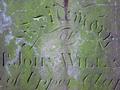
In memory ...by triciaComment by floyd: Good use of light and colour. Looks like you pushed the colour up quite a bit but it works for me. The lighting being strongly off to the side makes the carved letters easily readble and give the picture depth. Great shot. |
| 08/06/2002 09:08:00 AM |
In memory ...by triciaComment by autool: Interesting shot, I would have liked to be able to read the whole inscription. I feel that the word "of" should have either been centered or purposly placed in a vertical third. In my opinion, Autool |
| 08/06/2002 03:58:00 AM |
|
| 08/06/2002 12:49:00 AM |
|
| 08/05/2002 09:39:00 PM |
In memory ...by triciaComment by jimmsp: Something old. Use your photographic technique to emphasize the age of your subject. Composition - quite good Technical Aspects - quite good Meets Challenge - yes Visual Impact / Originality - good Looks old, would have liked a date shown. |
| 08/05/2002 07:27:00 PM |
|
| 08/05/2002 06:40:00 PM |
In memory ...by triciaComment by jmsetzler: i wonder if the sense of 'old' would be greater if the whole marker was included in this photo? Since no dates are included, there is no real reference of old.. the image also lacks a sense of depth... - jmsetzler |
Home -
Challenges -
Community -
League -
Photos -
Cameras -
Lenses -
Learn -
Help -
Terms of Use -
Privacy -
Top ^
DPChallenge, and website content and design, Copyright © 2001-2026 Challenging Technologies, LLC.
All digital photo copyrights belong to the photographers and may not be used without permission.
Current Server Time: 05/29/2026 11:28:09 AM EDT.