| Image |
Comment |
| 08/05/2002 01:09:00 PM |
|
| 08/05/2002 10:19:00 AM |
|
| 08/05/2002 09:20:00 AM |
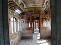
passengerby CheetahComment by 2ndgear: absolutely lovely...I love the fact it's crooked...the texture, the lighting...I'm giving it a 9..(and that's because I harldy ever give 10s) |
| 08/05/2002 02:39:00 AM |
passengerby CheetahComment by Kathyc: Nice. It seems to lean, however and that sort of distracts from its other lines. |
| 08/05/2002 02:08:00 AM |
|
| 07/29/2002 12:26:00 AM |
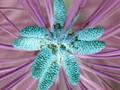
Flourishby CheetahComment by Cheetah: I want to thank everyone for commenting. I was taking some shots of pine tree bark when I saw the cones. I tried for a while to get a good shot but I kept having depth of field issues. Since I wasn't sure how to correct this, I thought maybe I could mask it a bit with the negative shot. I was also pleased with the colors that were produced. I thought this might add a bit of artistic flair, but in hindsight, I see that this was really a cheap trick to hide my lack of technical skill. This was my first submission online....not only to DPC, but anywhere for critique. It was a pleasure, and I have learned a few things in the process. Mostly, that the critics don't like color inversion... :)~ ...but alot of people like the final colors. Thanks again, and keep your camera close. Aaron |
| 07/28/2002 09:03:00 AM |
Flourishby CheetahComment by Gracious: This could be a great photo but the depth of field is too shallow rendering a photo that isn't as sharp as it could be. |
| 07/26/2002 07:50:00 PM |
Flourishby CheetahComment by Swashbuckler: Neat reverse color effects! Everything has texture, even pine tress (or cones), but in jumbling the colors, I feel the texture is harder to relate to (way square on my part). Cropping parts of your subject (two cones got tipped!) is not good. I am going to stay with my 7 score, as I like the idea so much! Swash |
| 07/26/2002 07:30:00 PM |
|
| 07/26/2002 04:33:00 PM |
Flourishby CheetahComment by FranziskaLang: i'm trying to figure out why you inverted the colors. i went and 'uninverted' them to look at your original picture and i liked those colors better. but then - that's just my personal taste. i did think you could see the texture there a little better. -- gr8photos (4) |
Home -
Challenges -
Community -
League -
Photos -
Cameras -
Lenses -
Learn -
Help -
Terms of Use -
Privacy -
Top ^
DPChallenge, and website content and design, Copyright © 2001-2026 Challenging Technologies, LLC.
All digital photo copyrights belong to the photographers and may not be used without permission.
Current Server Time: 06/10/2026 09:18:26 PM EDT.