| Image |
Comment |
| 05/04/2005 10:03:54 AM |
|
| 05/04/2005 04:40:48 AM |
|
 Photographer found comment helpful. Photographer found comment helpful. |
| 05/01/2005 04:16:03 AM |
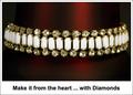
*by Moose101Comment by Brad: As I sat here looking at this shot, I struggled to figure out what it was that was so different about it then it suddenly hit me - the white border/framing.
This is a case of the border/framing actually working for the shot instead of against it. An advertisement would/could look very similar to this kind of lay out.
Composition is decent and the red in the background adds dimension instead of the jewelry floating in space. Overall, a pretty good take on the challenge. (6)
|
| Photographer found comment helpful. |
| 04/29/2005 11:36:16 PM |
*by Moose101Comment by LadeeM: Good job ... I just wish those diamonds were shining! |
| Photographer found comment helpful. |
| 04/29/2005 10:05:08 PM |
*by Moose101Comment by banmorn: I like the detail and background color in this very much. The composition is static.The ad copy might have been on in the image with a different font and light color. |
| Photographer found comment helpful. |
| 04/29/2005 04:32:58 PM |
" ... untitled ..." by Moose101Comment by sprite777: Nah - it's too coincidental. Same hand is closed, same wire is behind the arm, both hands are doing the exact same thing as the other picture. Couldn't be original. |
| Photographer found comment helpful. |
| 04/29/2005 01:23:19 AM |
*by Moose101Comment by md8speed: Good use of color and good control of the reflections |
| Photographer found comment helpful. |
| 04/28/2005 06:31:39 PM |
*by Moose101Comment by Montereykiddo: I would have liked a slightly larger depth of field, but this still works. Like the interesting red strip in the background. |
| Photographer found comment helpful. |
| 04/27/2005 08:54:25 PM |
*by Moose101Comment by shareinnc: Interesting piece of jewelry. A little sparkle on the diamonds would have improved the shot immensely. |
| Photographer found comment helpful. |
| 04/27/2005 01:33:17 PM |
*by Moose101Comment by nico_blue: thou shalt not use times new roman for design... i dont really like the border. composition is a bit akward, would have like the bracelet more anchored, right now it seems like its floating in space. i like the backdrop and how you captured the diamonds. |
| Photographer found comment helpful. |
Home -
Challenges -
Community -
League -
Photos -
Cameras -
Lenses -
Learn -
Help -
Terms of Use -
Privacy -
Top ^
DPChallenge, and website content and design, Copyright © 2001-2026 Challenging Technologies, LLC.
All digital photo copyrights belong to the photographers and may not be used without permission.
Current Server Time: 07/16/2026 11:14:37 PM EDT.