Don't Rub me the Wrong Wayby
KonadorComment by sylandrix: Greetings from the Critique Club...
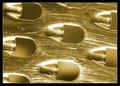
FIRST IMPRESSION... Well it took me a while to even realize what this was, and how it was related to milk, but your prediction says it all - its not that closely linked to the challenge, but it nonetheless is a remarkable image. And it looks like your score reflects that regardless of how close it fits the theme.
COMPOSITION... I've tried framing this other ways but I keep coming back to how you've presented it here. I especially like how you made your background, and how the lighting gives it depth. That was one of the reasons I couldn't identify the object at first. They don't look like holes - but bumps, due to the shading in each individual hole. That separates this image from a typical macro of a cheese grater - the light gives it further abstract quality as it fools the eye into seeing shapes that are not there! Well done indeed...
TECHNIQUE... I mentioned the lighting above. Not only is the background effectively rendered, but the lighting really brings out the scratches. I like the look it imparts on the photo. Gives the surface some texture. I find the contrast could be improved slightly. What I did in photoshop is make a level adjustment and brought the middle slider down to a value of ~ 0.65 Mostly a personal preference - I like having both extremes (dark shadows, almost white highlights) in photographs. Also makes a great image in black and white, but I think its more apparent that its contrast needs to be tweaked when viewing it in b&w. Always keep in mind that although I've calibrated my monitor to the best of my ability, it is possible many people here are looking at the same image and seeing quite a difference when it comes to brightness and contrast.
OVERALL... A very well lighted and composed shot. Don't think there's much that needs to be done to improve it. Really made me stop and stare at it for a while trying to figure it out :)