| Image |
Comment |
| 05/22/2004 08:48:42 PM |
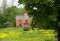
Springtimeby emorgan49Comment by ChrisW123: Should have not included the tree in the foreground. The door of the house looks interesting... you should have tried taking a close up of that instead. |
 Photographer found comment helpful. Photographer found comment helpful. |
| 05/19/2004 05:44:55 PM |
Springtimeby emorgan49Comment by MrAkamai: I like the house in the background and I feel that it should have more presence in the photo. In this current state it's the tree that takes precedence as it covers a higher percentage of the frame than the house does and it's in the foreground; a double whammy, if you will. |
| Photographer found comment helpful. |
| 05/19/2004 07:23:24 AM |
Springtimeby emorgan49Comment by e301: why not crop out the entirety of the tree-trunk picture right? It would leave you with a genuinely centred composition, instead of the halfway-there shot, and would to my eye balance the composition more evenly. Not a bad image at all, but lacking in much real mood, either of drama, or gentleness, or peace. Perhaps needed a different light to caryy it off, or failing that more processing work to give it some punch. As it stands, it is fairly ordinary to me. 5 |
| Photographer found comment helpful. |
| 05/18/2004 10:15:21 PM |
Springtimeby emorgan49Comment by photom: This images produces a calming influence. Soft lighting, soft colors. Seems like the building isn't quite level and the sky draws a lot of un-needed attention. |
| Photographer found comment helpful. |
| 05/17/2004 05:01:36 PM |
Springtimeby emorgan49Comment by Fotowereld: the house is in the center, but meanwhile everything else gets my attention, because the house looks a bit dull..the tree in the front is also blocking my sight..maybe you should have stepped a few metres to the front?? |
| Photographer found comment helpful. |
| 05/17/2004 02:15:14 PM |
|
| Photographer found comment helpful. |
| 05/17/2004 12:21:54 PM |
Springtimeby emorgan49Comment by Donatien: You're not alone in doing this but I'll hand you the comment now, since it's a "shame on a really nice image". This is not centered. I'ts close to, but it's not. The house I'd say is the main object, and the door being the very centerpoint of the house. Moving it out of the center probably makes for a better image, but in this challenge I feel it's pushing the luck a bit. |
| Photographer found comment helpful. |
| 05/17/2004 10:00:07 AM |
|
| Photographer found comment helpful. |
| 04/30/2004 11:13:12 AM |
|
| Photographer found comment helpful. |
| 04/21/2004 08:28:38 PM |
|
| Photographer found comment helpful. |
Home -
Challenges -
Community -
League -
Photos -
Cameras -
Lenses -
Learn -
Help -
Terms of Use -
Privacy -
Top ^
DPChallenge, and website content and design, Copyright © 2001-2026 Challenging Technologies, LLC.
All digital photo copyrights belong to the photographers and may not be used without permission.
Current Server Time: 07/16/2026 08:05:18 PM EDT.