| Image |
Comment |
| 05/09/2003 01:58:46 PM |
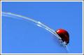
Round and Round by JackoComment by sher: i love this! simple and beautiful. great DOF and the colors are wonderful. well done! |
 Photographer found comment helpful. Photographer found comment helpful. |
| 05/09/2003 01:48:12 PM |
|
| Photographer found comment helpful. |
| 05/09/2003 12:38:33 PM |
Round and Roundby JackoComment by K-Rob: Excellent composition and color. Throw some yellow in there and you're ready to re-shoot for the "Primay Colors" challenge. |
| Photographer found comment helpful. |
| 05/09/2003 10:55:32 AM |
Round and Roundby JackoComment by scroosloose: Simple and clean. Really like the subtle reflection of the bug. Perhaps just a bit more DOF to get the bugs head in focus.
Mark |
| Photographer found comment helpful. |
| 05/09/2003 09:26:43 AM |
Round and Roundby JackoComment by jdavis: This a very cool picture. One of my faves. I like how the color & line of the glass draws your eye to the focal point. |
| Photographer found comment helpful. |
| 05/09/2003 08:46:31 AM |
|
| Photographer found comment helpful. |
| 05/09/2003 06:40:24 AM |
Round and Roundby JackoComment by pinback: Made me smile. Simple, but very effective shot. Perhaps just a little too bright? But still very good. |
| Photographer found comment helpful. |
| 05/09/2003 01:08:43 AM |
O Canadaby JackoComment by rogerspaul: I should have know it was you! and your comment on my Maple Leafs drowning Ya should know its me! LOl my glass submission is a Bubba and I did over saturate I coulnt get the blue right? Cheers Jacko Love the image ! learnt more about layers i guess i havent figured that out yet
Paul |
| Photographer found comment helpful. |
| 05/08/2003 02:16:14 PM |
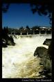
Grand Falls, New Brunswickby JackoComment by eloise: Good concept, that's a postcardy subject all right, but your contrast is pumped WAY high. The water is blinding white, the sky almost twilight-dark, and the whole thing is painful to look at. The water's so bright you can't really see anything on it - it washes out the detail, and drags your eye down to something that isn't interesting to look at, rather than any actual focal point in the picture itself. The border and font label are just right for a postcard, though. |
| Photographer found comment helpful. |
| 05/08/2003 02:10:22 PM |
|
| Photographer found comment helpful. |
Home -
Challenges -
Community -
League -
Photos -
Cameras -
Lenses -
Learn -
Help -
Terms of Use -
Privacy -
Top ^
DPChallenge, and website content and design, Copyright © 2001-2026 Challenging Technologies, LLC.
All digital photo copyrights belong to the photographers and may not be used without permission.
Current Server Time: 07/24/2026 09:34:45 PM EDT.