| Image |
Comment |
| 06/04/2002 03:38:00 PM |
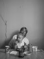
Breakfastby VodkamanComment by PixelatedVisions: If you cut off the top to just above their heads and get that line out of the shot I think it would be a little better. |
| 06/04/2002 03:29:00 AM |
Breakfastby VodkamanComment by irae: Closer. The faces and toast are all that's really necessary in this image. The rest is just distractions. |
| 06/03/2002 11:25:00 PM |
|
| 06/03/2002 05:25:00 PM |
Breakfastby VodkamanComment by justine: Neat b&w. Composition could use some correction. More focus on the baby and less on the blank/dead wall. However, I like this shot. I'm a sucker for cute kids/moms and real life shots. Nice job. |
| 06/03/2002 03:38:00 PM |
Breakfastby VodkamanComment by mtngoat: I'm not sure I understand why you left so much head room. I think if you'd gone with a 640x480 vs. 480x640 and gotten rid of the cord in the background... this would have been a much better shot. Nice expression/face stuff by the kid! |
| 06/03/2002 03:35:00 PM |
Breakfastby VodkamanComment by albright1: Very sweet... I wish you had cropped a bit more. As the picture came up on my screen, I first saw the nail in the wall above their heads, and I thought the title (breakfast) referred to a fly on the wall or something. |
| 06/03/2002 02:07:00 PM |
|
| 06/03/2002 12:49:00 PM |
|
| 06/03/2002 07:20:00 AM |
|
| 06/03/2002 06:31:00 AM |
Breakfastby VodkamanComment by jmsetzler: I think this photo would work much better with a little more zoom and the subject filling more of the frame.. I think the dead space at the top of the photo is a bit much... |
Home -
Challenges -
Community -
League -
Photos -
Cameras -
Lenses -
Learn -
Help -
Terms of Use -
Privacy -
Top ^
DPChallenge, and website content and design, Copyright © 2001-2026 Challenging Technologies, LLC.
All digital photo copyrights belong to the photographers and may not be used without permission.
Current Server Time: 03/31/2026 06:32:36 PM EDT.