| Image |
Comment |
| 10/29/2004 03:40:59 PM |
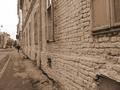
Poor Streetby cristiansComment by rennie: I think it would've been interesting to make a shot of the building on the left only. The eyes are directed towards the fine building in the background so it doesn't leave the impression it is poor street indeed. The building on the left with its texture, old windows, etc. is just perfect for the challenge topic. I like duotone here as it makes the texture of the wall stronger. 7 for me.
Edited: Building on the right for God's sake.... Sorry for the mistake and congratulations with your top 50 placement. Message edited by author 2004-11-05 18:55:02. |
| 10/29/2004 06:11:19 AM |
Poor Streetby cristiansComment by kiwinick: It looks poor maybe from neglect, it does need money spending on it but the city etc..........I see the story. |
| 10/29/2004 12:21:13 AM |
Poor Streetby cristiansComment by vontom: I like this one. The lines on the wall taking most of hte image has a really closed-in feeling. I feel that is appropriate for the challenge. But I think mostly I just like it. (8) |
| 10/28/2004 01:37:00 PM |
|
| 10/27/2004 06:22:37 PM |
|
| 10/27/2004 06:17:10 AM |
|
| 09/26/2004 07:33:13 AM |
|
| 09/23/2004 08:11:04 PM |
|
| 09/23/2004 03:41:27 PM |
|
| 09/23/2004 12:27:06 AM |
|
Home -
Challenges -
Community -
League -
Photos -
Cameras -
Lenses -
Learn -
Help -
Terms of Use -
Privacy -
Top ^
DPChallenge, and website content and design, Copyright © 2001-2026 Challenging Technologies, LLC.
All digital photo copyrights belong to the photographers and may not be used without permission.
Current Server Time: 07/16/2026 01:49:20 AM EDT.