| Image |
Comment |
| 01/21/2007 12:40:07 PM |
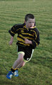
RFC6.jpgby BrookiedComment by KHolt: looks like you were slightly in the wrong position on this image, like the guy on the sideline shouting and the action frozen. I think if you lowered your line of sight below the players then you'll get more images with impact |
| 01/21/2007 12:37:44 PM |
RFC4.jpgby BrookiedComment by KHolt: nice shot, get in close to increase the impact, I like the line of the cones though, if you stay wide like this though Message edited by author 2007-01-21 12:38:23. |
| 01/21/2007 12:37:04 PM |
RFC3.jpgby BrookiedComment by KHolt: good sharpness, like the undone shoelace and the cuts on the leg, the image would be even better if the eyes helped back up the expression on his face. Crop tighter, crop tight and then go even further! |
| 01/21/2007 12:35:12 PM |
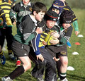
RFC21.jpgby BrookiedComment by KHolt: great colours, and good facial expressions, crop tighter and concentrate on the things that are interesting in the photo, the lads faces are priceless! |
| 01/20/2007 05:58:12 PM |
|
 Photographer found comment helpful. Photographer found comment helpful. |
| 01/20/2007 11:25:55 AM |
|
| Photographer found comment helpful. |
| 01/20/2007 10:28:48 AM |
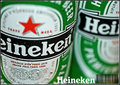
Heinekenby BrookiedComment by Melethia: Lighting is very good to my eye. I like the depth of field used except I think the brand name goes a little soft on the "ine" part and you might want that just a wee bit stronger for advertising purposes. As far as the positioning, I like it. The condensation on the can is a very nice touch - adds texture and interest. I think you're definitely headed in the right direction. |
| 01/18/2007 08:02:49 PM |
Darraghby BrookiedComment by quiet_observation: By the expression on his face, this looks like perfect timing. The focus and lighting is fantastic. I'm sure this would have done well in the b&w portrait challenge. You probably would have heard about the window frame but since when do portraits all have to be done in a formal studio? |
| 01/18/2007 02:34:24 PM |
Darraghby BrookiedComment by noraneko: Welcome to Team Suck!
I really like the soft lighting (looks like natural source - guessing a window) and shadows on face. The expression is faintly impish and captured well by the eyes looking back toward the camera. If I had a suggestion it would be to put the eyes more in the "two-thirds" position, as the balance feels a bit off. A bit more definition between pupils and irises might also help bring out character. All in all, I think this would have scored pretty well. I assume this is your son? Adorable. |
| 01/18/2007 03:34:42 AM |
Darraghby BrookiedComment by Melethia: The eyes have it - I love the sly little look toward the camera. Very nice use of natural light and the shadow it creates - adds depth and texture to the shot. Here's an idea to try - try a square crop starting from the bottom up. It'll cut off the top of the head, but will put the eyes on a "third" line. Gives it a different feeling - a bit more power, maybe. It's really a very nice shot and I suspect it would have scored fairly well. As I said to begin with - you got the "look" - and to me, that's what makes it good. |
Home -
Challenges -
Community -
League -
Photos -
Cameras -
Lenses -
Learn -
Help -
Terms of Use -
Privacy -
Top ^
DPChallenge, and website content and design, Copyright © 2001-2026 Challenging Technologies, LLC.
All digital photo copyrights belong to the photographers and may not be used without permission.
Current Server Time: 07/17/2026 02:44:46 PM EDT.