| Author | Thread |
|
|
02/20/2007 12:20:48 PM |
|
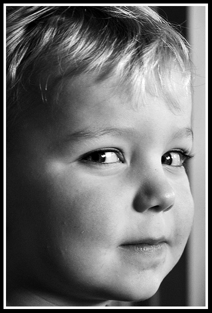
I like your photos. you seem to be able to capture some wonderful moments, something special in everyday and in ordinary. this is a wonderful portrait, the lighting and the focus are excellent and I almost envy your b&w convertion:) and would love to hear how you did it. excellent sharpness and details and still not hyper-realistic. very very good! |
|
|
|
01/18/2007 08:02:49 PM |
|
By the expression on his face, this looks like perfect timing. The focus and lighting is fantastic. I'm sure this would have done well in the b&w portrait challenge. You probably would have heard about the window frame but since when do portraits all have to be done in a formal studio? |
|
|
|
01/18/2007 02:34:24 PM |
Welcome to Team Suck!
I really like the soft lighting (looks like natural source - guessing a window) and shadows on face. The expression is faintly impish and captured well by the eyes looking back toward the camera. If I had a suggestion it would be to put the eyes more in the "two-thirds" position, as the balance feels a bit off. A bit more definition between pupils and irises might also help bring out character. All in all, I think this would have scored pretty well. I assume this is your son? Adorable. |
|
|
|
01/18/2007 03:34:42 AM |
|
The eyes have it - I love the sly little look toward the camera. Very nice use of natural light and the shadow it creates - adds depth and texture to the shot. Here's an idea to try - try a square crop starting from the bottom up. It'll cut off the top of the head, but will put the eyes on a "third" line. Gives it a different feeling - a bit more power, maybe. It's really a very nice shot and I suspect it would have scored fairly well. As I said to begin with - you got the "look" - and to me, that's what makes it good. |
|
|
|
01/15/2007 04:48:30 PM |
|
|
|
01/15/2007 04:44:22 PM |
|
I like the soft lighting in this one. Works really well. Might want to try a little bit of lightening around the eyes, because they are a little hard to recognize. Also the white bar behind the subject that runs along the frame of the photo is a bit distracting, as it leads the viewer straight out of the photo, perhaps a little bit of burning would fix that. Again, I like the photo. Just wanted to give a little criticism. Hope it helps :)! |
|
 Photographer found comment helpful. Photographer found comment helpful. |
Home -
Challenges -
Community -
League -
Photos -
Cameras -
Lenses -
Learn -
Help -
Terms of Use -
Privacy -
Top ^
DPChallenge, and website content and design, Copyright © 2001-2026 Challenging Technologies, LLC.
All digital photo copyrights belong to the photographers and may not be used without permission.
Current Server Time: 07/23/2026 01:33:14 AM EDT.