| Image |
Comment |
| 04/25/2005 05:16:10 PM |
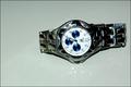
on sale 1,000by gtp1164Comment by Brad: Most watches should be in a vertical compsoition, or an angle at best. The horizontal arrangement here doesn't work too well, as the viewer feels the need to tilt their head to read the words/text on the watch face. |
| 04/25/2005 12:53:41 PM |
|
| 04/25/2005 10:37:51 AM |
|
| 04/25/2005 09:45:18 AM |
|
| 04/25/2005 09:44:38 AM |
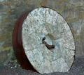
rock wheelby gtp1164Comment by ecko313cheer: This is a nice image. I like the line seen in the wheel of this image. I wish you would have backed up a little bit though because the image almost looks a little bit out of focus as you work your way to the outside of the image but that may just be how the rock looks in general. Nice work though. |
| 04/25/2005 09:02:05 AM |
on sale 1,000by gtp1164Comment by Shaman: Nice colour, good focus, good Dof. The only negative I see is IMO, I would have reversed this image, so that the twelve as on the left. That way it would seem like the watch was point up, instead of down. |
| 04/25/2005 12:58:01 AM |
|
| 04/24/2005 11:30:58 PM |
tiffanyby gtp1164Comment by aerogurl: beautiful girl, but i do not care for this soft effect, its very out of focus and shows no detail. |
| 04/24/2005 10:27:32 PM |
|
| 04/24/2005 10:22:28 PM |
|
Home -
Challenges -
Community -
League -
Photos -
Cameras -
Lenses -
Learn -
Help -
Terms of Use -
Privacy -
Top ^
DPChallenge, and website content and design, Copyright © 2001-2026 Challenging Technologies, LLC.
All digital photo copyrights belong to the photographers and may not be used without permission.
Current Server Time: 07/17/2026 06:19:20 AM EDT.