To the Pointby
TerryGeeComment by Koriyama: *critique club*
Overall
Terry, I've had a look through your profile and posted stuff. You are a good photographer with a sharp eye for composition and colours. I won't, therefore, try and claim that you made a 'mistake' in this photo. I think that you deliberately aimed for the effects you created. (Having browsed your 'prettypixel' site, I know that you have an interest in creating photographs that seem painted.)
A question that we must ask ourselves seriously in this site is do we accept criticisms from those who, clearly, don't know what we're trying to do in our art? I believe that the answer must be a firm yes. This site contains some very highly skilled photographers and some commenters who don't even own a camera. This gamut reflects our public to a large extent. Negative, or uninformed, comments will be felt by those in the general scene, and it's very helpful for us to receive those opinions, too.
Your photograph can be judged on a number of different levels, therefore: as an art work, forgetting actual photographic considerations; as a photograph, where camera techniques apply; and as avante-garde photography, which this piece is, where even so-called 'bad' techniques are used for particular effects.
Technique
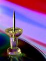
Actually, I like this. If I had taken it, it would be on my wall for a while. Maybe I'd have liked the colours to have been more vivid, a brighter light source would have helped. The grain is, perhaps, a little too pronounced, although you used a very wide aperture. The image seems a bit affected by jpeg artifacts, although I suspect that's one technique you use to create the blocky, paint-like feel. I don't think that some elements are developed well-enough. The light refraction seems unintentional, especially at the base of the pin. The cd(?)'s right-hand side is very sharp, unlike the rest. The actual focal point appears to be just a touch forward leaving the image just a shade unsharp.
You set up very simple objects well, and the composition is very effective. The negative space is used well, and the shot features no unnecessary elements. Good work.