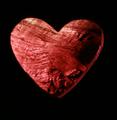
DPChallenge: A Digital Photography Contest You are not logged in. (log in or register
 
Browse Settings
Currently viewing:
Registered UserLeeD

Show comments:

Per page:

Order:

Comments:


Comments Received by LeeD
Pages:   ... [111] [112] [113] [114] [115] [116] [117] ... [119]
Showing 1131 - 1140 of ~1186
Image Comment
Baby Slippy 2
08/04/2005 08:38:26 AM
Baby Slippy 2
by LeeD

Comment by Strikeslip:
Bravo!
Photographer found comment helpful.
Baby Slippy
08/04/2005 08:35:07 AM
Baby Slippy
by LeeD

Comment by Strikeslip:
LOL, good one!
Photographer found comment helpful.
Baby Slippy 2
08/03/2005 11:10:11 PM
Baby Slippy 2
by LeeD

Comment by Art Roflmao:
LOVE it!
Photographer found comment helpful.
Baby Slippy
08/03/2005 10:40:50 PM
Baby Slippy
by LeeD

Comment by RobotBanjo:
ROTFL!!!
Photographer found comment helpful.
Trunk Bay
08/03/2005 10:38:37 PM
Trunk Bay
by LeeD

Comment by RobotBanjo:
How fantastic this looks! I wish I were there right now!
Photographer found comment helpful.
Soft
08/03/2005 01:31:49 PM
Soft
by LeeD

Comment by SJCarter:
First off let me say that I remember this image very well from the challenge. It also reminded me of an Anne Geddes shot. It has a lot of emotional appeal (everyone likes babies) and the softness and purity of the light really add to the overall mood.

There are a couple of things I don't think work as well as they could though. The discoloration around the baby's eye is a bit of a distraction (although I understand no spot editing allowed in basic challenge) and the crop didn't really work for me. I like the high key feel you've established and the bright white light, but I think a different crop might have served you better here - instead of close at the top, maybe close at the bottom? Probably the biggest hit your score took though was because (as several other people have said), the actual textures in the image are too subtly displayed.

I like it and think it's really a good shot - just not necessarily represented the best it could have been for a Textures Challenge.

Just my 2 cents...
Photographer found comment helpful.
Heart Wood
08/03/2005 11:15:11 AM
Heart Wood
by LeeD

Comment by SJCarter:
*Critique Club*

First let me say that I think this met the Wooden Challenge topic well. I am surprised you didn't receive more comments though, given its final score.

Composition
Okay to good. Jutilda is right in that a dead-on shot with this type of theme can work. The heart is a nice, fairly clean shape and the negative space could work, but I think there's a little too much of it - a closer crop might have helped. Compositionally, it's okay, but I think it got mired down with the technical execution.

Lighting
Since you chose to "mask" or "frame' the main subject of your shot, the lighting for it needs to be great. IMHO, it's too harsh on the left and too soft on the right. I realize you may have been going for a 3D kinda feel with the shadows to make the heart appear to jump out of the screen, but if so I don't think it worked. The color of the light is fine, but I think you needed more than the single light source to illuminate your subject adequately.

DOF/Focus
The lighting hurts you here as well, as there's not enough of it in the right places to allow the detail and textures of the wood to show up very well. The focus also seems very soft around the heart frame (which I think would work better sharp) and in the upper left part of the wood.

Overall
I think it was/is a neat idea, but the execution pulled your score down. It met the challenge just fine, but wasn't pulled off well enough to hold the viewers' interest. Perhaps if you had shot & lit the wood in both the frame and the heart it would have done better.

Remember, this is just my 2 cents... You can take it or leave it as you please. :-)

Jimmy
Photographer found comment helpful.
Sunrise on the Outer Banks
07/29/2005 01:02:24 PM
Sunrise on the Outer Banks
by LeeD

Comment by MarkArtisan:
I love this photo...But,one thing that I can't help feeling is that it seems to slant downward abit on the left....
Beautiful Composition and Colors!!!!!! Great Shot!!!
Photographer found comment helpful.
Soft
07/28/2005 10:59:11 AM
Soft
by LeeD

Comment by cpanaioti:
For this particular challenge the image was probably a bit too subtle.

As an image, here are my thoughts.

Composition: I think you chose a good vantage point and if you look closely there are leading lines in the folds of the blanket.

Exposure: Maybe a bit too high key though the skintone seems right. More light on the blanket to bring out the folds I think may have made for a stronger image.

Impact: Subject matter I think helps here. Very sweet. Good shot for the album. For wider appeal though I think more emphasis on some of the other elements is needed (folds in blanket etc.)
Photographer found comment helpful.
Soft
07/26/2005 07:52:51 PM
Soft
by LeeD

Comment by yanko:
Nice photo but I don't think this works for this specific challenge. The textures in this shot is not the focus and is rather hard to make out. It might have worked if the folds in the blanket or the details in the ruffles were darker or if there was a strong focus on the baby's skin texture.
Photographer found comment helpful.
Pages:   ... [111] [112] [113] [114] [115] [116] [117] ... [119]
Showing 1131 - 1140 of ~1186


Home - Challenges - Community - League - Photos - Cameras - Lenses - Learn - Help - Terms of Use - Privacy - Top ^
DPChallenge, and website content and design, Copyright © 2001-2025 Challenging Technologies, LLC.
All digital photo copyrights belong to the photographers and may not be used without permission.
Current Server Time: 06/16/2025 11:06:12 AM EDT.