| Image |
Comment |
| 08/25/2004 04:45:43 PM |
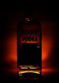
Ironyby RedOakComment by panzerman: Masterfull use of light. Simple, poster-like composition. Very graphic, very communicative. One would wish a touch of light to suggest the top of the bottle: it would complement for strong high light at the bottom. Bravo! |
| 08/25/2004 01:18:42 PM |
Ironyby RedOakComment by Dr.Confuser: I hope it's just my monitor but this is pretty dark. I can see the red background, the silhouette of the bottle and the the Absolut Vodka words but little else. From what I can see, it could be a pretty dramatic image but I can see so little I don't see the tie in to hope. |
| 08/25/2004 01:54:52 AM |
Ironyby RedOakComment by ajschmidt: How is this ironic?
The Dictionary: At its most basic, a difference or gap between the presentation/representation of something and its reality. In other words, when what something appears to be and what it is are not the same.
Vodka is to be appreciated, not scorned. Now it's not Gray Goose but it's better than water. |
 Photographer found comment helpful. Photographer found comment helpful. |
| 08/25/2004 01:21:41 AM |
Ironyby RedOakComment by JJacobson: The point of this is beyond me. Maybe I'm just not seeing something. |
Home -
Challenges -
Community -
League -
Photos -
Cameras -
Lenses -
Learn -
Help -
Terms of Use -
Privacy -
Top ^
DPChallenge, and website content and design, Copyright © 2001-2026 Challenging Technologies, LLC.
All digital photo copyrights belong to the photographers and may not be used without permission.
Current Server Time: 07/15/2026 07:07:12 PM EDT.