"Common"by
bladComment by SJCarter: * Greetings from the Critique Club *
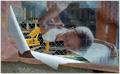
I remember this entry from a recent challenge and thinking WOW what a fantastic shot! I LOVE the model & expression on her face. It screams to me of any local urban nursery wherein you know the locals on sight. It has a beautiful "familiar" feel to it and the composition really reinforces this emotion.
The colors & composition are wonderful. I would say that the lighting seems a bit harsh in spots, so if you were to reduce the backlighting and/or increase the contrast a bit, you might find even more detail & hidden treasures to show. Along the same lines, the sky could use a little more color - namely blue. There are several ways in which you can achieve that (as you probably already know), but I think that a little less glare would only further enhance the warm familiar feeling that the shot already conveys.
I'm not crazy about the green border either. I think that the picture speaks for itself without the added color (but that's just my opinion - I know that borders can frequently add a lot to a shot, I'm just not sure that in this particular instance it works in your favor).
Overall, the photo is excellent. I know that I scored it quite highly in the challenge (8-9 if I recollect correctly).
I also find it difficult to really point out many features that warrant reexamination and/or improvement. The lighting glare is the most obvious one to me. A secondary one might be the clarity of the background images - a certain degree of OOF begins to enter the image as you stray from the close-up subjects.
Again, I can't stress enough what a warm familiar feeling this image brought to mind for me. That alone is worth a LOT in my book. When you can evoke that strong of an emotion from the viewer, then you know you've been doing your job well!
Just my 2 cents...