| Image |
Comment |
| 11/23/2006 04:32:15 PM |
|
 Photographer found comment helpful. Photographer found comment helpful. |
| 11/23/2006 03:24:00 PM |
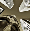
To the sky by nico_blueComment by macrothing: 8 - Very nice. Toning works very well here, adding good depth/drama. Might be a shot that cannot be appreciated at this size and the resizing has caused aspects like the (seemingly) 'overexposure' to be accentuated. Maybe an even squarer framing/crop, who knows, else a more refined crop, mainly to eliminate the white 'something' near bottom left corner. Likewise, undedided if I would prefer to see more of the 'different' building coming into frame on the left, else it cropped out altogether and the chimera/'gargoyle' featuring more prominently. Excellent perspective. |
| Photographer found comment helpful. |
| 11/23/2006 01:42:40 PM |
|
| Photographer found comment helpful. |
| 11/23/2006 12:28:25 PM |
To the skyby nico_blueComment by Spitfyr: I love it!!! The way the modern buildings are almost overexposed and the old building is darker. The modern seems to lean out over and dwarf the old. Yet the older building appears sturdier and well grounded where the modern seems fragile. Fantastic! - 10 |
| Photographer found comment helpful. |
| 11/23/2006 03:44:41 AM |
|
| Photographer found comment helpful. |
| 11/23/2006 03:36:45 AM |
|
| Photographer found comment helpful. |
| 11/22/2006 09:19:10 PM |
To the skyby nico_blueComment by photoslik1967: This is by far the most impressive photo submitted in this challenge. Great choice of septa. I like the darker sky in contrast to the lighter buildings. The photo is amazingly clear and crisp. You deserve first place. Good Luck. I vote a perfect 10. |
| Photographer found comment helpful. |
| 11/22/2006 07:53:27 PM |
To the skyby nico_blueComment by dragonlady: excellent use of perspective and duotone(perhaps sepia?) all those diagonal lines make for a very interesting composition drawing the eye up; looks like the Turk's Head building in Providence at left bottom which softens the image and adds more interest... |
| Photographer found comment helpful. |
| 11/22/2006 06:47:08 PM |
To the skyby nico_blueComment by bassbone: okay - this is awesome - great use of duotone and excellent angle. I feel a little queezy looking at the photo - i feel as if I will fall backwards! |
| Photographer found comment helpful. |
| 11/22/2006 05:20:53 PM |
To the skyby nico_blueComment by sherpet: Excellent, and this one sefinately stands out really well in this challenge. Tops in my book..... |
| Photographer found comment helpful. |
Home -
Challenges -
Community -
League -
Photos -
Cameras -
Lenses -
Learn -
Help -
Terms of Use -
Privacy -
Top ^
DPChallenge, and website content and design, Copyright © 2001-2026 Challenging Technologies, LLC.
All digital photo copyrights belong to the photographers and may not be used without permission.
Current Server Time: 07/19/2026 06:47:07 AM EDT.