On the verges of sanityby
nico_blueComment by HBunch: *Critique Club*
Well, I'm not really sure what to say about this. I supose some will love it, some will hate it. I unfortunately am in with the group that will not like it. I only have my opinion to offer, since this is quite abstract to me.
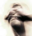
The dark thing,, that is going horizontal across the dead center of the shot (I don't know what it is) stands out quite a bit and kind of divides the photo in half. Not knowing what it is, is a bad thing to me, since I think I'm trying so hard to figure out what it is that i'm even looking at, that I don't even see the rest of the photo unless I force myself to look...in other words, it's a distraction to what I feel is suposed to be the 'main focus' of the photo.
The only thing you can really recognize out of the photo, is a mouth, and that's not really clear. No, I could not tell that 1/2 the mouth is smiling and 1/2 is grimacing. It's all kind of a blurry jumble of something really.
I like the 'sepia-ish-ness' I agree that had this been in color, it might have been a complete disaster. I also can appreciate the background. It's a very good thing that there is nothing in the background that is distracting or making more shapes/patterns to clutter up the photo in that way.
I'm not sure about the crop. I'm wondering if having the face/neck in the lower right corner, with a little more negative space to the upper left might have a different appeal?? Something that could be tried anyway.
I hope you take this as just one opinion, and don't take it personally. A lot of people will like it, it's just not my cup of tea. You like it, and that's all that really matters anyway.
~Heather~