| Image |
Comment |
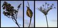
| 12/18/2004 10:24:54 AM |
Winterby thatcloudthereComment by deapee: It doesn't really work for me. All three just seem a bit out of focus. My eyes just don't really like how the middle one is so much smaller. Sorry for my brutal honesty, really just trying to help (I know my opinion doesn't mean much, thought I'd share it anyway though). |
 Photographer found comment helpful. Photographer found comment helpful. |
| 12/18/2004 09:00:55 AM |
Winterby thatcloudthereComment by Arcanist: Very honest and well thought out critique. You're right, the lighting of the weeds is too dark, but you can overcome that with the fill flash on a very low setting. At the risk of blasphemy, I would also mirror image the one on the right to help balance out the shot.
You have done very well in balancing the weight of each individual frame and that is half the battle. I am not sure I know what you mean by the stem comment as I find the stem size vs main subjects to be very good. More stem might require a much heavier border set to bring it back into perspective. |
| Photographer found comment helpful. |
| 12/17/2004 08:17:05 AM |
|
| Photographer found comment helpful. |
| 12/16/2004 05:25:58 AM |
Collisionby thatcloudthereComment by e301: Wonderful documentary work. That blated out feeling to the processing is entirely appropriate, the juxtaposition of the ... oh, hang on, are those markes where the car's been pulled out of the ditch? The baby carriage adds an almost too good to be true element of the sentimental (no, that's not an accusation, just a wondering whether it doesn't over-egg the puddding). fine fine work - that over-exposure of the road allows the distracting elements there to become insignificant. I wonder though, for a scene which of itself holds great power to affect, if a vvery staightforward treatment wouldn't be the more effective for making the audience more familiar with the world it contains? I mean a muted but full colour treatment, keeping the full control of exposure everywhere? But I like it this way too. A strong contender in my book (though I expect that's a book that many won't find agreement with). |
| Photographer found comment helpful. |
| 12/15/2004 01:03:10 AM |
Collisionby thatcloudthereComment by KDO: Brutal and stark. It certainly fits the challenge. I love the choice of high key. I am uncomfortable with the cropping. Too much ditch, not enough car. 7 |
| Photographer found comment helpful. |
| 12/14/2004 05:18:49 PM |
|
| Photographer found comment helpful. |
| 12/14/2004 05:50:22 AM |
Collisionby thatcloudthereComment by Rankles: Perhaps more focus on the cars themselves would improve the shot as you can barely see their damage and they don't appear as the main subject. GOod photo though. |
| Photographer found comment helpful. |
| 12/13/2004 05:29:34 PM |
Collisionby thatcloudthereComment by davidbedard: Very emotive. Especially with the stroller down in the ditch. Good treatment of a harsh subject for a very sobering effect. |
| Photographer found comment helpful. |
| 12/13/2004 02:05:57 PM |
Collisionby thatcloudthereComment by strags: I'm not really sure what's going on here, which is a shame, because it looks like there's an interesting story being told. I'm not sure how well "broken" is conveyed as a result. |
| Photographer found comment helpful. |
| 12/13/2004 04:40:28 AM |
|
| Photographer found comment helpful. |
Home -
Challenges -
Community -
League -
Photos -
Cameras -
Lenses -
Learn -
Help -
Terms of Use -
Privacy -
Top ^
DPChallenge, and website content and design, Copyright © 2001-2026 Challenging Technologies, LLC.
All digital photo copyrights belong to the photographers and may not be used without permission.
Current Server Time: 07/16/2026 12:55:39 AM EDT.