DPChallenge: A Digital Photography Contest You are not logged in. (log in or register
 
Browse Settings
Currently viewing:
Registered Uservisaksen

Show comments:

Per page:

Order:

Comments:


Comments Received by visaksen
Pages:   ...
Showing 41 - 50 of ~431
Image Comment
Vestre Strandallé 100
09/07/2006 09:16:18 PM
Vestre Strandallé 100
by visaksen

Comment by yantski:
I think a bit darker perhaps.
Photographer found comment helpful.
Vestre Strandallé 100
09/07/2006 07:16:40 AM
Vestre Strandallé 100
by visaksen

Comment by redmoon:
i gave this a 6. as a choice of subject, i like it; it's obviously structurally knackered, and the amount of delapidation gives the house both a sense of age, and a sense of a sad, unloved history. i also like the pleasing use of symmetry, and how it is bordered by the drain pipes on either side. what tones down it's WOW! is the bland colour of the brickwork that seems to infiltrate everything, including the windows and window frames. changing to b&w and really maxing the contrast might have enhanced the grunginess appeal somewhat. i'd also like to see how a close-up photograph of the number 100 with the house as a softer background might look...
Photographer found comment helpful.
Vestre Strandallé 100
09/04/2006 09:43:45 AM
Vestre Strandallé 100
by visaksen

Comment by Jaded_Housewife:
the crack adds a lot of interest to this. otherwise just a bit too straight on. a more dynamic POV would help. 6
Photographer found comment helpful.
Vestre Strandallé 100
09/03/2006 08:53:54 PM
Vestre Strandallé 100
by visaksen

Comment by nfessel:
interesting shot. i almost just skipped this one, but it's interesting because the windows look like they're painted. weird building.
Photographer found comment helpful.
Vestre Strandallé 100
09/02/2006 10:27:44 AM
Vestre Strandallé 100
by visaksen

Comment by hahn23:
Precision architectural image with zero trapezoidal effects. Bravo! Real life "accessories" in the foreground and age details in the building make this come alive.
Photographer found comment helpful.
Vestre Strandallé 100
09/02/2006 10:16:50 AM
Vestre Strandallé 100
by visaksen

Comment by Elvis_L:
nice warm colors. I think I would like ti neater (straighten flower posts etc.) or more run down (more pronounced cracks)
Photographer found comment helpful.
Vestre Strandallé 100
09/01/2006 02:51:08 PM
Vestre Strandallé 100
by visaksen

Comment by Brad:
Though lacking a main or central focal point to me, the entire image becomes the focal point in all reality.
Certainly one to stare at a while and see subtle details Well seen!
Photographer found comment helpful.
Vestre Strandallé 100
09/01/2006 02:14:41 PM
Vestre Strandallé 100
by visaksen

Comment by naplesmusc:
Nice photo and crop. 7
Photographer found comment helpful.
Vestre Strandallé 100
09/01/2006 02:02:36 PM
Vestre Strandallé 100
by visaksen

Comment by twm122:
I love the look of the front of the house. I like your composition.
Photographer found comment helpful.
accordion with indicator ver. 2
06/13/2006 02:44:46 AM
accordion with indicator ver. 2
by visaksen

Comment by kari1:
::: Critique Club :::

Hi, my name is Kari and from the critique club.

First Impression - the most important one:
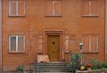
An interesting picture to retake ... some improvements .. but some errors as well.

Subject:
This meets the challenge ... and does so very well .. but I am not sure that you used the comments you hasve recieved to create this new image .. so that you have taken the shot and just used your more critical eye to improve.

Composition:
This works well .. you have the indicators on the thrids horizontal ... and the white line in almost there at the top ... this is a narrower shot ... which is quite lovely in that it seems to create its own length and create great lines for the eyes to follow.

Technical (Colour and light):
I really like the crispness of the colours on the first shot .. they seem so much more vibrant .. although from the dirt I would say that the bus was newer then :) ... I think this is natural light and that is fine ... the image seems slightly sharper this time, and it has not been overdone which is great.

To grow its vote?:
I agree with Yanko .. cloning out the dirt would have been a smart move ... it just makes it a pic of something dirty. Also the colours sold better more vibrant and looking at that may also help.

Summary:
Great work ... and a good improvement from the original .. keep it up.

If you've got any questions about this critique, please feel free to contact me via the PM system.

Cheers

Kari
Photographer found comment helpful.
Pages:   ...
Showing 41 - 50 of ~431


Home - Challenges - Community - League - Photos - Cameras - Lenses - Learn - Help - Terms of Use - Privacy - Top ^
DPChallenge, and website content and design, Copyright © 2001-2025 Challenging Technologies, LLC.
All digital photo copyrights belong to the photographers and may not be used without permission.
Current Server Time: 06/16/2025 09:57:26 AM EDT.