| Image |
Comment |
| 11/02/2006 01:37:05 PM |
|
 Photographer found comment helpful. Photographer found comment helpful. |
| 11/01/2006 08:16:48 PM |
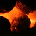
Heart of the Hearthby riotComment by L1: I am assuming this is a shot of coals, but it's hard to tell without some context or other imagery around it. Good color and exposure. :) |
| Photographer found comment helpful. |
| 11/01/2006 06:59:42 PM |
Heart of the Hearthby riotComment by jaysonmc: Great photo. Something new and differnt. Great lighting, color, and texture. Maybe croping a big of the dead space off the bottom? Minor, still have you finishing top 10. |
| Photographer found comment helpful. |
| 11/01/2006 01:09:25 PM |
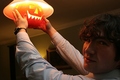
The Pumpkin Carverby riotComment by cogerox: Very creative idea. The overhead light is still too bright, though. Maybe if you'd put in a lower watt bulb? |
| Photographer found comment helpful. |
| 11/01/2006 05:32:27 AM |
|
| 11/01/2006 04:26:13 AM |
|
| Photographer found comment helpful. |
| 10/13/2006 07:09:27 AM |
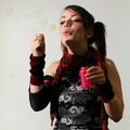
Kissby riotComment by atupdate: Hello from the Critique Club,
Let me start off by saying you achieved one of the hardest things to accomplish when using non-professional models, the model looks relaxed and natural. There are two items that probably hurt your score the most on this entry, the background and the shadow on her face. One of the DPC rules when using a white background is that it should to be a clean looking white or shows an intentional gradient with a clean looking white focal point. Filler light on the background or a contrasting background would have helped here tremendously. As for the shadow, there are a couple of solutions to this problem. One would be have the lighting on the opposite side of the raised hand or to reverse the hands holding the wand and the bottle. The other would be to use a reflector to fill in the shadows. For this shot I think I would prefer that the model switch hands and blow bubbles in the other direction. I like the contrast achieved with the side lighting you set up and using a reflector would have diminished that effect.
Feel free to PM me if you have any questions regarding this critique.
Tim
|
| Photographer found comment helpful. |
| 10/07/2006 09:24:37 AM |
|
| Photographer found comment helpful. |
| 10/07/2006 01:04:02 AM |
Kissby riotComment by lynnmarie: Composition is good. I think that the shadows on her neck and face are a bit
distracting. |
| Photographer found comment helpful. |
| 10/06/2006 02:16:15 PM |
Kissby riotComment by Blackbox: Yo...at the risk of sounding crude, a better title might have been...umm...nevermind. I think the photo would have been a little more interesting if you could have somehow cloned the wand and bottle out of the photo. I like the contrast of the colors...more bubbles please! |
| Photographer found comment helpful. |
Home -
Challenges -
Community -
League -
Photos -
Cameras -
Lenses -
Learn -
Help -
Terms of Use -
Privacy -
Top ^
DPChallenge, and website content and design, Copyright © 2001-2026 Challenging Technologies, LLC.
All digital photo copyrights belong to the photographers and may not be used without permission.
Current Server Time: 07/15/2026 07:06:20 PM EDT.