| Image |
Comment |
| 04/21/2003 09:43:49 PM |
|
| 04/21/2003 10:56:15 AM |
|
| 04/21/2003 04:00:59 AM |
|
| 04/18/2003 04:31:26 PM |
|
| 04/13/2003 06:07:54 PM |
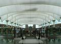
Airportby amonteforteComment by floyd: Greetings from the Critique Club
My first impression of your picture is of the very very strong symmetry in it. Congrats on meeting the challenge so well. My second thought is of light - or more accurately the lack of it. It's hard to imagine an airport that isnt well lit but somehow this picture manages to look underexposed and dim. That's a real shame because with more light you'd have picked out the lovely reds and yellows of the figures either side of the escalator.
Your composition is what makes this shot a winner. The balance of those ceiling beams against the escalator and the rails is just right - excellent use of the rule of thirds. Your focus seems just fine too with plenty of depth of field. I see you stopped up to f/8 - I wonder if your camera did that automatically or whether you chose that small aperture deliberately to get the depth of field. I'm going to guess that you did it yourself and that forced you to increase your exposure time up to 1/60th which is about the slowest shutter you can hold with your hands without getting shake. That's probably how you ended up with a slightly underexposed picture. Perhaps you should have moved your camera's ISO rating up to 200 or even 400. On a detailed image like this I doubt the grain of an ISO 400 image would have been visible.
All in all I'm given the impression of a photographer that knows how to use all the buttons on the camera as well as having a keen eye for a good shot. Your composition is great and getting it without any people in-shot was a real bonus - not easy at an airport! |
| 04/11/2003 01:13:13 PM |
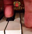
Untitledby amonteforteComment by dsidwell: Greetings from the Critique Club!
You've received a lot of good comments below. I'll just add that I like this shot a lot. This takes my mind and feelings to the intricacy of music, as well as the technical aspects of it, so it makes my mind go beyond the photo and on to other things: to me a sign that it's a really good shot!
With this in mind, what makes this image work for me is the lighting and the the point of view. The lighting is moody and unscientific and helps us get to the point that music is a communication of images, perhaps, and not just scientific notes played into the air. The point of view shows us a glimpse (and "glimpse" is the right word here as your cropping is also excellent) as to how the magic of music happens.
Someone noted the brightness of the keys at lower left, and that may or may not be true. I don't think it detracts, but I think that you need the 3-D of the keys.
Beautiful shot and well executed. Creative and refreshing idea.
Thanks,
-David |
| 04/06/2003 02:42:22 PM |
|
| 04/06/2003 12:43:46 PM |
|
| 04/06/2003 11:23:03 AM |
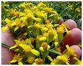
Untitledby amonteforteComment by Silver Fox: When you're too lazy to give your piece of work a title, I wonder if we should be too lazy to vote on it or to comment on it! |
| 04/06/2003 11:06:52 AM |
Untitledby amonteforteComment by inspzil: Excellent macro. Not sure about the framing, but I do really like the colors and the DOF of this shot. Nice idea |
Home -
Challenges -
Community -
League -
Photos -
Cameras -
Lenses -
Learn -
Help -
Terms of Use -
Privacy -
Top ^
DPChallenge, and website content and design, Copyright © 2001-2026 Challenging Technologies, LLC.
All digital photo copyrights belong to the photographers and may not be used without permission.
Current Server Time: 07/16/2026 10:01:23 AM EDT.