| Image |
Comment |
| 08/28/2002 06:27:00 AM |
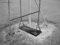
...by prodigal havocComment by Kaz: Black and white was an excellent choice here, lets the viewer concentrate on the swing. |
| 08/28/2002 05:07:00 AM |
...by prodigal havocComment by Holtw: Interpretation of the challenge 2/4 Technical Aspects 1/4 WOW Factor 0/2 Total 3 |
| 08/27/2002 09:51:00 PM |
...by prodigal havocComment by myqyl: A fine job on the lighter range of grey, but the darker range is largely missing... Very nice concept/execution... |
| 08/27/2002 08:19:00 PM |
...by prodigal havocComment by HBunch: This looks like a really old swing. I would trust sitting on it. LOL. With so many swings, it's hard to judge one over another. I like this one because it's wooden. I don't know what kind of backgrounds there would be from a different angle, so maybe this was the best angle for the situation, but I think the poles in the back are kind of distracting. I would also like to see the color version of this for comparrison. nice job and good luck in the challenge. |
| 08/27/2002 03:00:00 PM |
...by prodigal havocComment by Swashbuckler: This is a different looking swing than most of the others. I'm not fond of B&W, and though there is some fairly good contrast, this shot doesn't appeal to me in that scheme. (I think it's the grass) 7 Swash |
| 08/27/2002 12:54:00 PM |
...by prodigal havocComment by jmsetzler: The background behind the swing (the bars and poles) are somewhat distracting from the swing itself. I wonder if there may have been a more interesting angle from which this photo could be made? - jmsetzler |
| 08/27/2002 10:57:00 AM |
|
| 08/26/2002 07:15:00 PM |
...by prodigal havocComment by just-married: I looked at this one for a while. I found the lines distracting. I tried to look at them openly - wondered if the illusion of the lines was perhaps even the intent of your photo, but ultimately I found them more visually distracting than interesting. The bar that connects whe two poles of the swing really almost seems to connect instead to the chain of the swing. B/W probably intensifies this. Just one person's opinion. I am sure it is precisely the lines that will appeal to many. 6, just-married |
| 08/26/2002 05:16:00 PM |
|
| 08/26/2002 03:10:00 PM |
...by prodigal havocComment by Kavey: Because the poles of the frame seem to be at odd angles I find myself focussing on them instead of the swing. When I look at the swing I like the wonderful texture. But then my attention is dragged back to the poles - they are definitely distracting for me. Would love to see a closeup of the swing seat with just a little chain, grass as the background, and nothing else in it. Kavey |
Home -
Challenges -
Community -
League -
Photos -
Cameras -
Lenses -
Learn -
Help -
Terms of Use -
Privacy -
Top ^
DPChallenge, and website content and design, Copyright © 2001-2026 Challenging Technologies, LLC.
All digital photo copyrights belong to the photographers and may not be used without permission.
Current Server Time: 07/08/2026 11:01:39 PM EDT.