| Image |
Comment |
| 05/18/2006 10:33:24 PM |
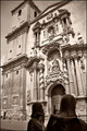
St. James arriving to the templeby alexgarciaComment by Rebecca: Hi Alex!
This looks like a beautiful old church (basilica?)! No one does it quite like the Europeans, I think. Excellent choice of subject here. I like the aged b/w treatment.
There are some blown highlights on the face of the building and I think it's a diffuser or a polarizer that would help with that? I honestly don't remember which since I don't own that sort of equipment at this point. I wish I could see the top of the temple or, as an alternative, see a tighter crop with less height - at least then it would look like a more deliberate choice, less like you just ran out of camera space. In the lower left there's a darker gray strip of road or sidewalk that is a little distracting, I don't think anything would be lost by cropping it out. |
 Photographer found comment helpful. Photographer found comment helpful. |
| 05/18/2006 06:27:36 PM |
|
| Photographer found comment helpful. |
| 05/17/2006 09:27:03 PM |
St. James arriving to the templeby alexgarciaComment by margiemu: From CTP2:
I commented during the challenge, but I'll look a little closer Ü.
I like the duotone effect in this. It works well. The subject you picked is good - lots of interest. The statues at the front are sort of growing on me, but maybe if you would have included just a tad more of them, so they didn't look so cut off? And somehow lit them a little more so they weren't quite as dark? I like what you were trying to do, though, and they do give the photo some perspective.
Overall a nice shot. |
| Photographer found comment helpful. |
| 05/17/2006 04:05:57 PM |
St. James arriving to the templeby alexgarciaComment by yanko: Greetings from CTP2
Good choice on color treatment. Composition-wise, I like how you included foreground and background elements which gives the image depth and interest. I'm not sure I like the perspective of the building but I'm not really sure how you could fix that within this particular composition (with the statues) or using basic editing.
Btw, I do like the statues in there and they are level so it equalizes the building tilt somewhat. Other than that I like the photo. The color and detail is pleasing. The statues themselves add some contrast and a focal point that leads you up the image. Message edited by author 2006-05-17 16:07:59. |
| Photographer found comment helpful. |
| 05/17/2006 02:40:19 PM |
|
| Photographer found comment helpful. |
| 05/17/2006 06:31:00 AM |
|
| Photographer found comment helpful. |
| 05/16/2006 07:29:39 PM |
|
| Photographer found comment helpful. |
| 05/16/2006 02:45:26 PM |
|
| Photographer found comment helpful. |
| 05/15/2006 09:02:58 PM |
|
| Photographer found comment helpful. |
| 05/14/2006 10:35:19 PM |
You can't judge a book by its coverby alexgarciaComment by blackenedwhite: From the CTP MkII
Okay, I'll be trying a different crit format for this particular entry. To keep it short and sweet.
What Works:
The lighting's great, the exposure's great, the subject's funny. This particular mix got it placed where it is right now.
What Needs Improvement:
The shallow DOF. And the page misalignment. But I guess you know of these by now. These prevented you from placing higher, IMO.
Summary:
Minus minor nitpicks, it IS a great entry for the challenge. Congrats on your current PB. |
| Photographer found comment helpful. |
Home -
Challenges -
Community -
League -
Photos -
Cameras -
Lenses -
Learn -
Help -
Terms of Use -
Privacy -
Top ^
DPChallenge, and website content and design, Copyright © 2001-2026 Challenging Technologies, LLC.
All digital photo copyrights belong to the photographers and may not be used without permission.
Current Server Time: 06/22/2026 01:26:41 PM EDT.