| Image |
Comment |
| 05/25/2006 09:01:57 PM |
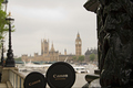
Daddy and son visiting Londonby alexgarciaComment by Rebecca: This is an adorable idea. The composition is alright, though I'd like to see more of a color pop since the color seems a bit dull. I'm honestly not sure what to improve upon otherwise, this was such a strange challenge topic to judge. |
 Photographer found comment helpful. Photographer found comment helpful. |
| 05/25/2006 01:42:07 PM |
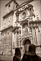
St. James arriving to the templeby alexgarciaComment by Gunnsi: From CTP2 Gunnsi
First impression: Beautiful church, somebody standing in the way of it and what is that building in the left?
What is good?
1. Focus, contrast and light are all good.
What can be better?
1. I am not sure it was a good choice to make it B/W, I miss the blue sky.
2. Maybe skip a bit of the left of the church and trying to have the statues a bit higher and more to the right.
3. Use fill flash on the statues. |
| Photographer found comment helpful. |
| 05/25/2006 11:49:42 AM |
|
| Photographer found comment helpful. |
| 05/24/2006 09:44:58 PM |
Daddy and son visiting Londonby alexgarciaComment by Rooster: Hey Alex,
Greetings from the CTPII!
I think this is a cute shot with a lot of potential. The exposure and focus is nice and well done. What takes away from this shot, IMHO, is that is it overly busy. The statue in the foreground and even the light pole in the background seems to be competing for the focal point. The sky is a bit washed out but it's rainy London so I'm sure there's not much to do about that. I wonder what this shot would have looked like at night or approaching dawn.
Hope this helps a bit.
Peace
Rooster |
| Photographer found comment helpful. |
| 05/24/2006 05:06:00 AM |
Daddy and son visiting Londonby alexgarciaComment by yanko: Greetings from CTP2
Ha! Very funny.
Technicals:
The lighting is ok but I think I might have liked a bit more on the lens cap to make the lettering stand out more or something else to add some wow factor to this.
Subject/composition:
Nice idea for the subject. Composition-wise, I wish that sculpture thing wasn't there but otherwise it works fine.
Suggestions for Improvement:
I think you carried off the idea well but it lacked that something extra. Maybe have the "daddy" lens cap tilted more so that lighting from the right could rake over it creating an interesting gradient. |
| Photographer found comment helpful. |
| 05/23/2006 10:04:18 AM |
|
| Photographer found comment helpful. |
| 05/23/2006 07:18:28 AM |
|
| Photographer found comment helpful. |
| 05/21/2006 09:44:15 PM |
|
| Photographer found comment helpful. |
| 05/20/2006 10:20:27 PM |
|
| Photographer found comment helpful. |
| 05/20/2006 05:34:06 PM |
|
| Photographer found comment helpful. |
Home -
Challenges -
Community -
League -
Photos -
Cameras -
Lenses -
Learn -
Help -
Terms of Use -
Privacy -
Top ^
DPChallenge, and website content and design, Copyright © 2001-2026 Challenging Technologies, LLC.
All digital photo copyrights belong to the photographers and may not be used without permission.
Current Server Time: 06/22/2026 01:26:41 PM EDT.