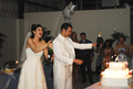
DPChallenge: A Digital Photography Contest You are not logged in. (log in or register
 
Browse Settings
Currently viewing:
Registered UserTravis99

Show comments:

Per page:

Order:

Comments:


Comments Received by Travis99
Pages:   ... ... [105]
Showing 211 - 220 of ~1043
Image Comment
Summers Here
07/03/2006 05:51:21 PM
Summers Here
by Travis99

Comment by coronamv:
Is this what an ant sees like the color and perspective
Party Time
06/06/2006 01:26:10 PM
Party Time
by Travis99

Comment by fotomann_forever:
::: Greetings from Critique Club :::

Hi, as requested, here is an indepth critique of your submission.

First Impression - the most important one:
Very nice wedding candid. I'm particularly amazed with the lack of harsh shadows that come from flash photography in low-light.

Composition:
Good for a candid shot. It does take on some of the look of a snapshot, but a well done one.

Subject:
Subjects are clear and stand out really well from the background.

Technical (Color, focus, and light):
Focus is good. Colour is a bit on the warm side, but not too terribly distracting.

You did well with the flash lighting in this low light situation.

To grow its vote?:
It's a great wedding photo, but just does haven't that special oomph that DPC voters want. Maybe some over-the-top editing for more drama and a different crop for a stronger composition.

Summary:
I like this photo. It show competence on the part of the photographer in low light situations.

Hope to see more from you soon,
Leroy
Party Time
05/30/2006 10:03:14 PM
Party Time
by Travis99

Comment by love:
nice!
Party Time
05/26/2006 04:13:34 PM
Party Time
by Travis99

Comment by EarlBaker:
Good action shot in a tough lighting situation. Congratulations to the happy couple.
Party Time
05/25/2006 05:41:59 PM
Party Time
by Travis99

Comment by ratz:
good capture of champers
Wading into eternity "graphicfunk tribute"
04/05/2006 07:03:40 AM
Wading into eternity "graphicfunk tribute"
by Travis99

Comment by taterbug:
Greetings from the Critique Club :-)

Hmmm, not sure what kind of critique I can give you on this shot. To me, it is actually a great tribute shot of the totally awesome original by graphicfunk. I think you did a very nice job on the shot. Far better than I could of done :-) , and probably far better than most folks could of done. It is most definitely very readily and quickly recognised as a tribute to 'Wading into Eternity'. The clarity of your hands and arms is great. The exposures look pretty good. Maybe just a touch hot on the top set of arms, but just minorly so. I think the image works well in b/w. I agree with the comment that Dan's original has the edge on lighting, and a slightly stronger composition. I think if you could of got a little better positioning of the arms, in relation to the body, it quite possibly could of bumped your score up. Still, 6.28 is not bad at all. A very fine tribute and great entry for this challenge. I agree with graphicfunk, this show's a great grasp of technique, come up with some concepts and show us what ya got! :-)

Sorry I couldn't muster up a better critique for you. If you have any questions or comments or anything, please feel free to contact me.

Happy shooting,
taterbug :-)
9.jpg
04/03/2006 05:53:35 PM
9.jpg
by Travis99

Comment by justin_hewlett:
Great use of leading lines, they work well and lead me right to the subject. I think I'd have to agree with bear that the composition is somewhat awkward.
9.jpg
04/03/2006 05:49:25 PM
9.jpg
by Travis99

Comment by Jutilda:
I Loooooooooooooove this. The scene creates an entire little world like a small diorama. It has all the elements to really make it interesting. The fence, the colors, the house in the distance, the bare trees and beautiful sky! WOW
4.jpg
04/03/2006 05:44:17 PM
4.jpg
by Travis99

Comment by cfischl:
This is probably my favorite of the bunch. The composition is very good. My only suggestion is maybe try to retake it when there are some more interesting clouds.

Message edited by author 2006-04-03 17:44:43.
9.jpg
04/03/2006 05:43:10 PM
9.jpg
by Travis99

Comment by Bear_Music:
This image has considerable interest, but it's not working for me compositionally. I find I like it better when crop from the left to eliminate the enclosure around the small tree.
Pages:   ... ... [105]
Showing 211 - 220 of ~1043


Home - Challenges - Community - League - Photos - Cameras - Lenses - Learn - Help - Terms of Use - Privacy - Top ^
DPChallenge, and website content and design, Copyright © 2001-2025 Challenging Technologies, LLC.
All digital photo copyrights belong to the photographers and may not be used without permission.
Current Server Time: 08/21/2025 02:16:54 AM EDT.