| Image |
Comment |
| 10/17/2005 09:07:59 AM |
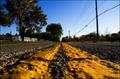
"up and down those backroad highways"by fotodudeComment by Jutilda: Very pretty, but I don't think the glow filter works here. It blurs it out too much. I like the colors of the sky, but the trees are so dark. Hmmmm - maybe save this for shots where it really accents the shot. The perspective is good. The leading line is effctive - maybe too centered though. Overall, a nice beginning - keep at it! ;~) |
 Photographer found comment helpful. Photographer found comment helpful. |
| 10/17/2005 05:25:02 AM |
|
| Photographer found comment helpful. |
| 10/16/2005 06:26:51 PM |
|
| Photographer found comment helpful. |
| 10/15/2005 08:27:43 AM |
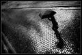
...dejected...by fotodudeComment by 1olddawg: Nice shot. Would have liked it taken just a bit closer with a bit less dead space on the left. Overall its a great idea and nice image. |
| Photographer found comment helpful. |
| 10/14/2005 11:39:44 AM |
...dejected...by fotodudeComment by DrAchoo: I had this as a 6, but on second thought I'm bumping to a 7. The best entries convey the feeling before the title is read, this is one that manages that. I can see dejected easily. The composition is nice and the black is nice and rich. I personally like the border, but know some people like to comment on such things. 7 |
| Photographer found comment helpful. |
| 10/14/2005 04:41:02 AM |
|
| Photographer found comment helpful. |
| 10/13/2005 12:27:50 PM |
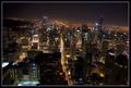
"back to that same old place, Sweet Home Chicago"by fotodudeComment by Neil: Beautiful night shot of "my town" (well, I never lived there, but I was born there at Michael Reese--I grew up in Gary, Indiana). I am mixed about the tilt, I really like the dynamic it adds, but it draws attention to itself too, perhaps because it's not tilted enough to say: this is purposefully tilted (though I am sure it was).
Overall, a great night city scene: hope you have a big version of this hanging on your wall! |
| Photographer found comment helpful. |
| 10/13/2005 12:21:47 PM |
|
| Photographer found comment helpful. |
| 10/12/2005 10:02:26 AM |
...dejected...by fotodudeComment by Jutilda: I think the doily detracts as it is the brightest spot of the photo. I do like the placement in the shot with all of that negative space. The roses seem slightly out of focus. |
| Photographer found comment helpful. |
| 10/12/2005 09:33:59 AM |
|
| Photographer found comment helpful. |
Home -
Challenges -
Community -
League -
Photos -
Cameras -
Lenses -
Learn -
Help -
Terms of Use -
Privacy -
Top ^
DPChallenge, and website content and design, Copyright © 2001-2026 Challenging Technologies, LLC.
All digital photo copyrights belong to the photographers and may not be used without permission.
Current Server Time: 07/18/2026 05:34:12 AM EDT.